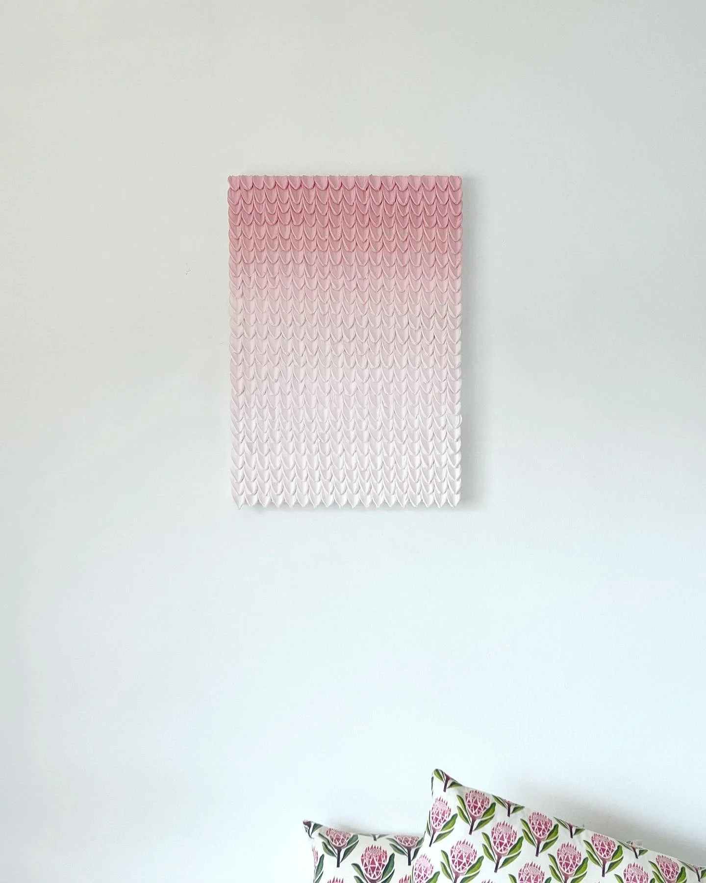
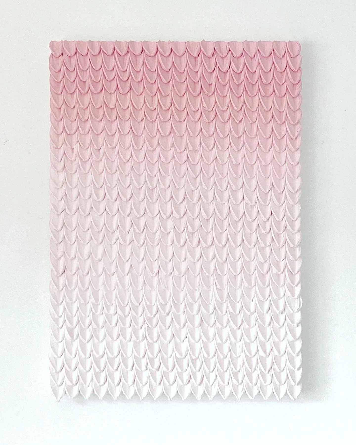
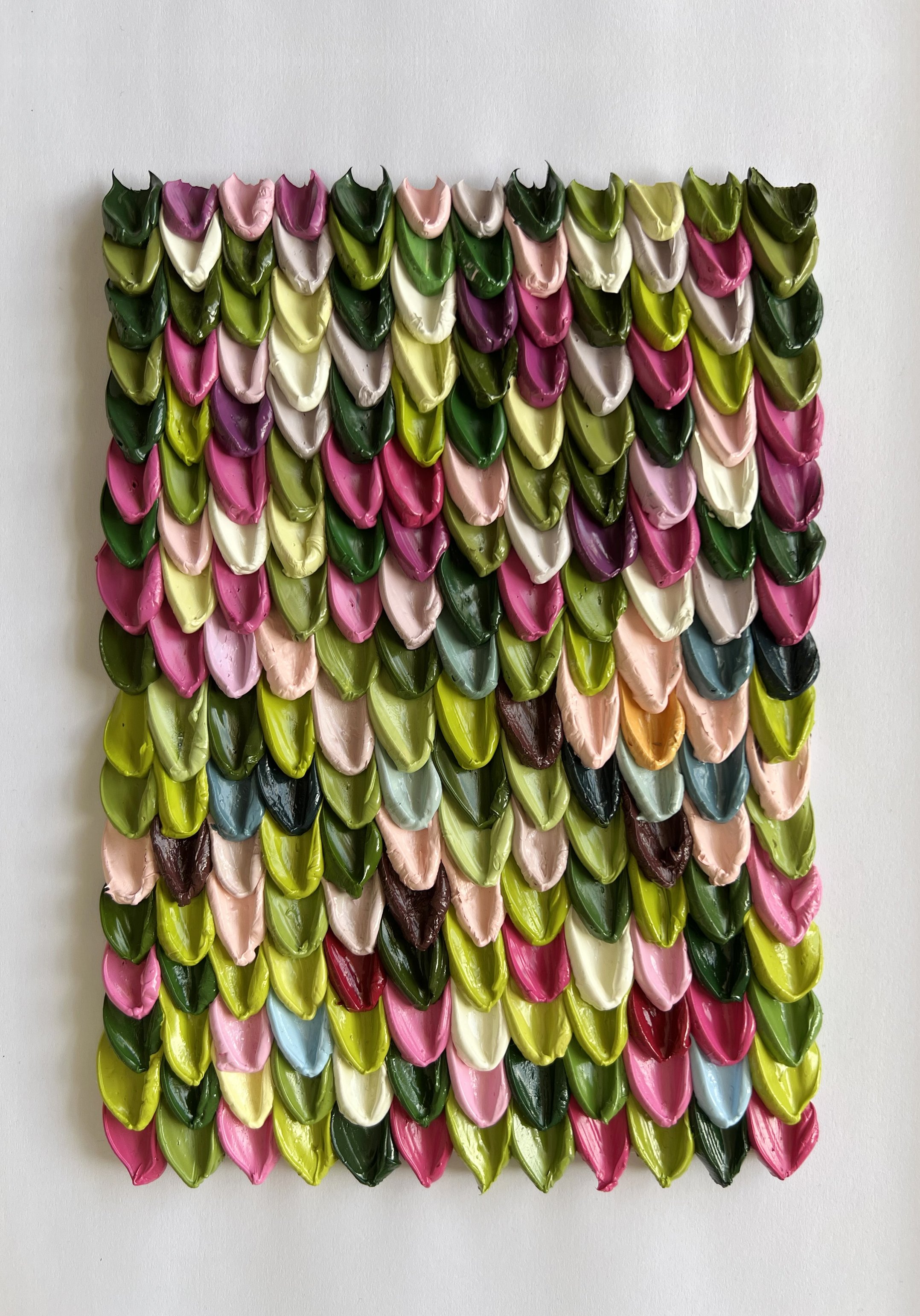
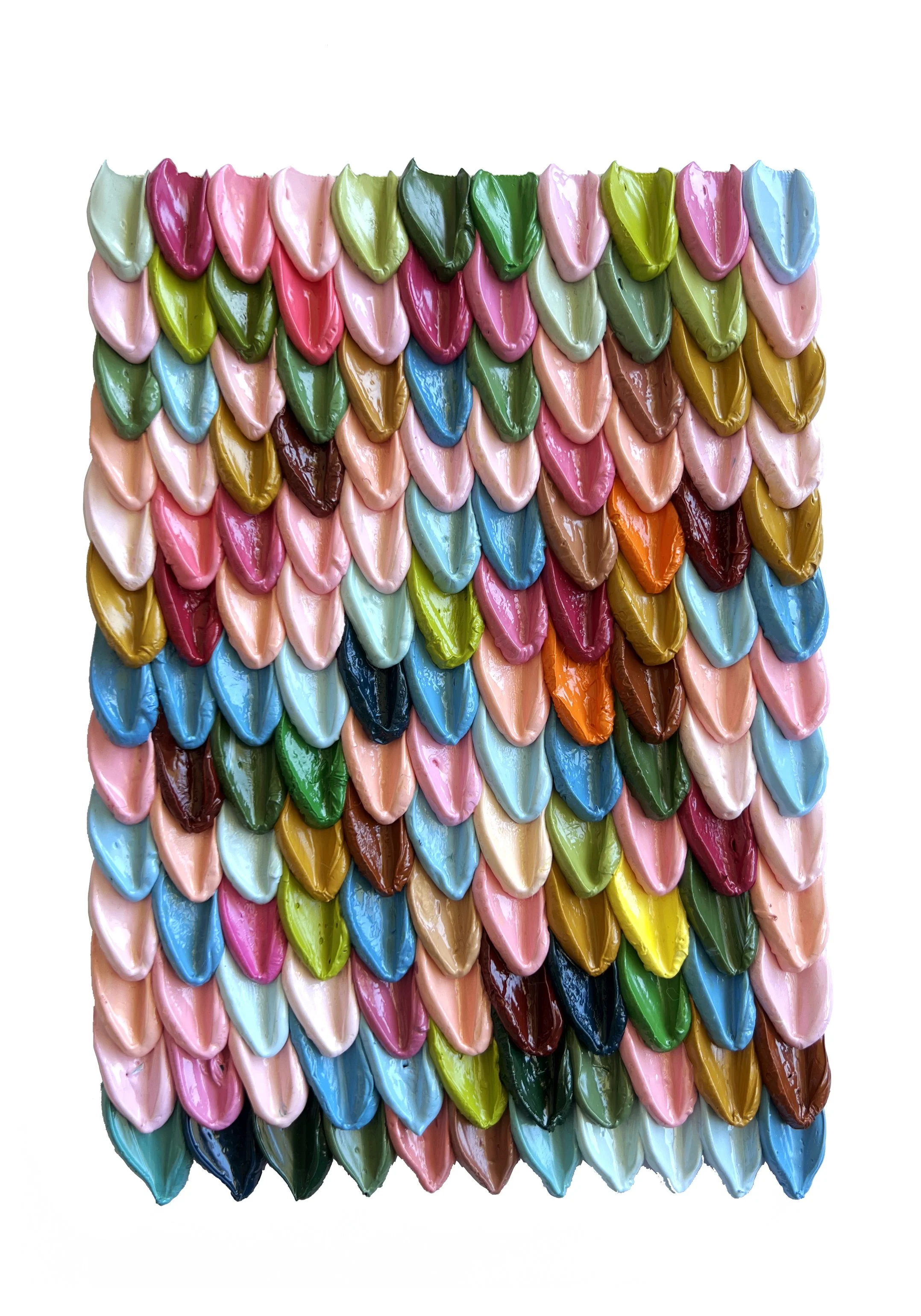
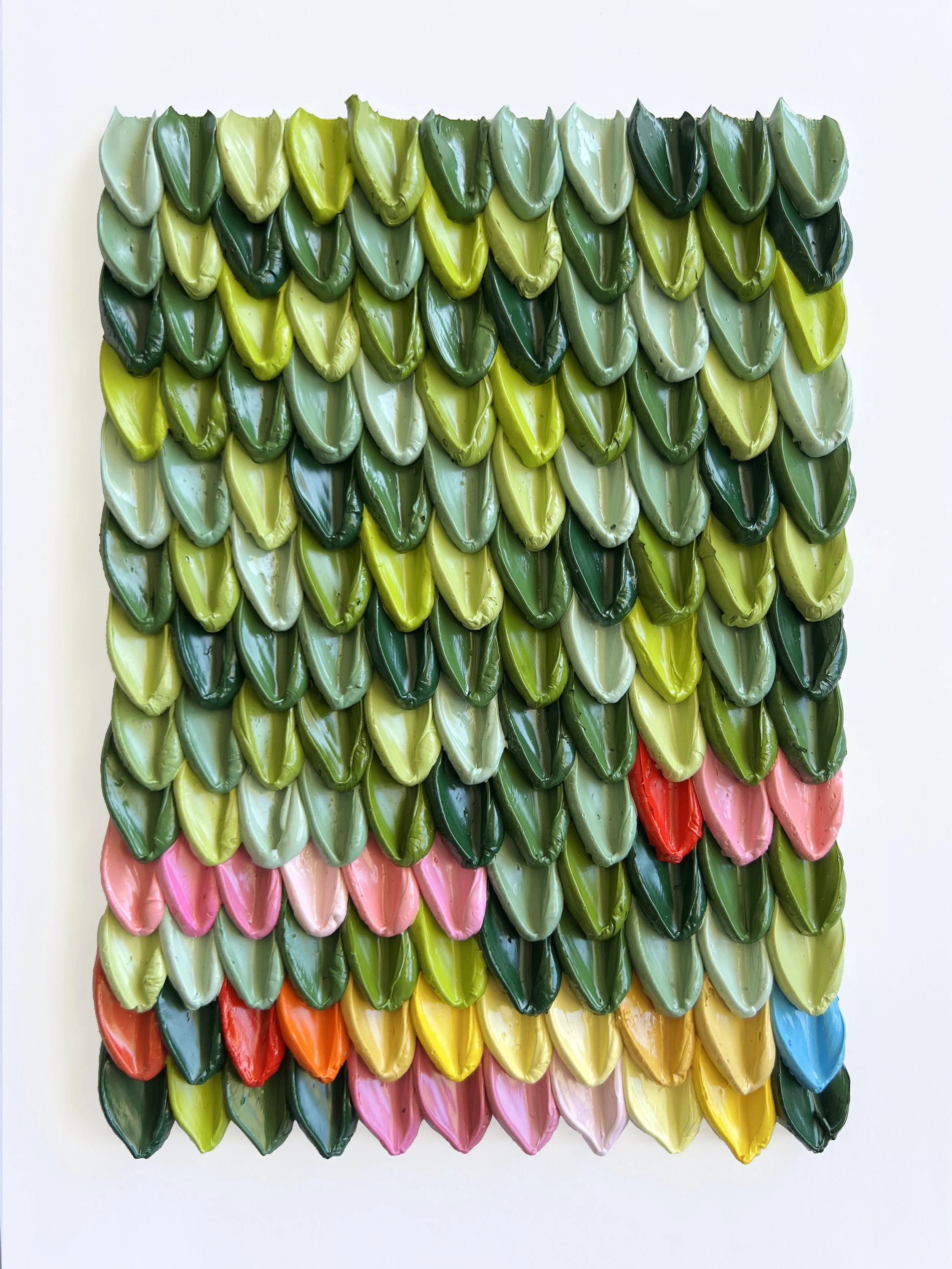
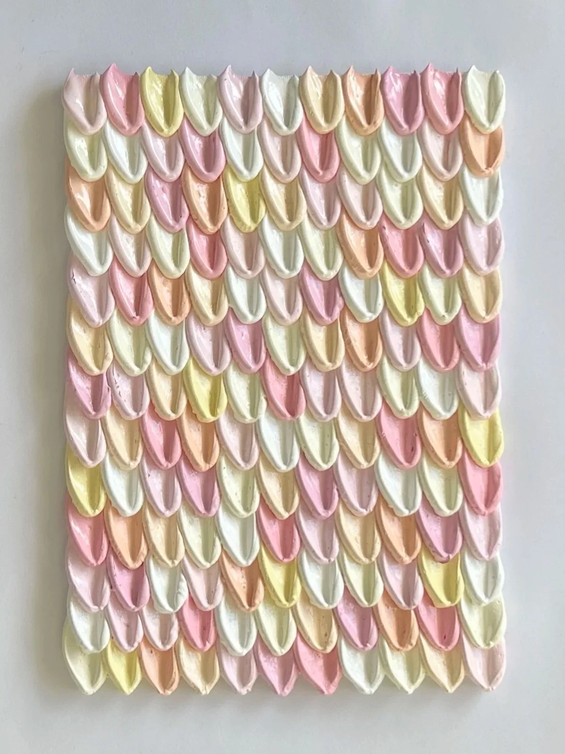
Palette Scallops
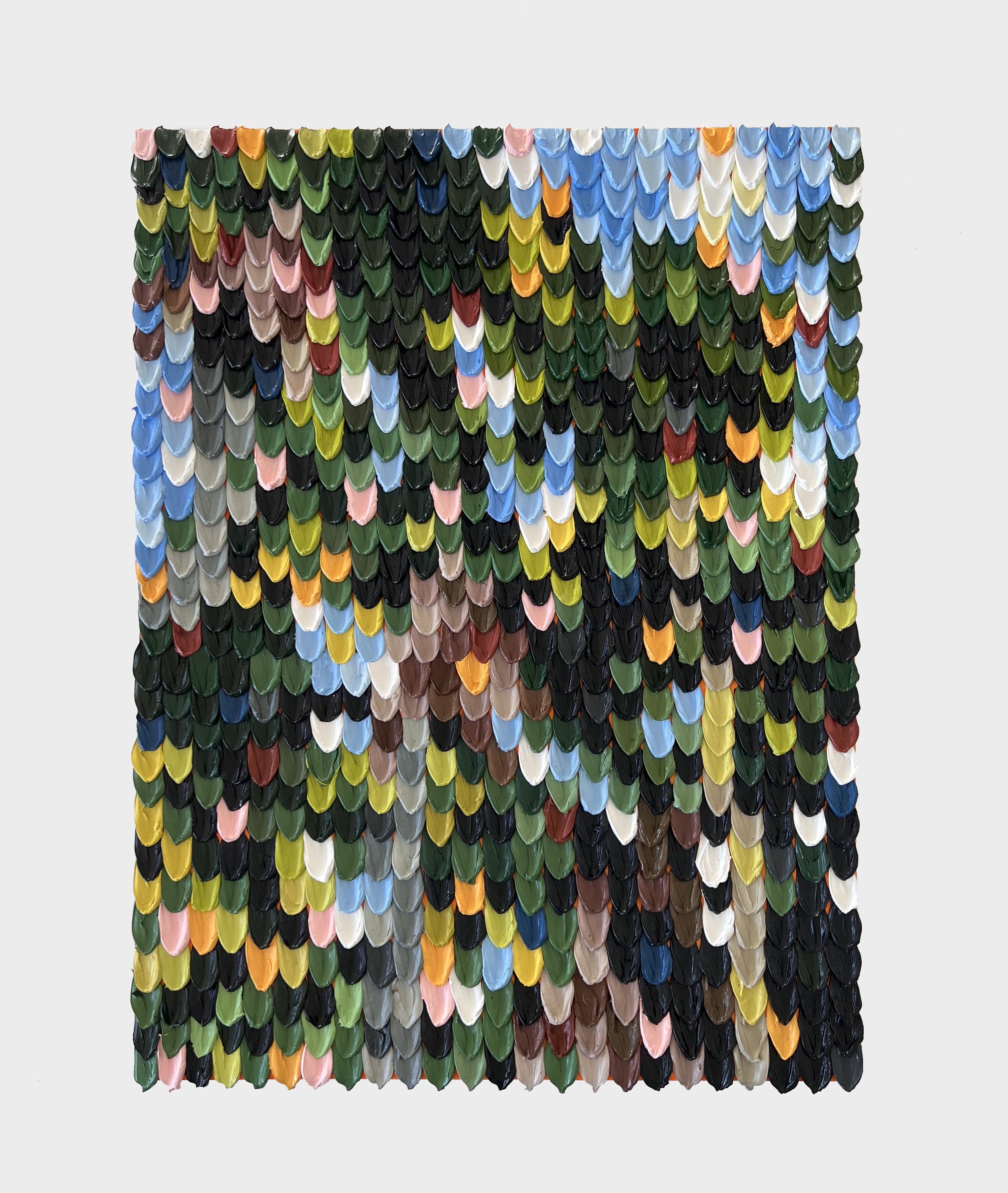
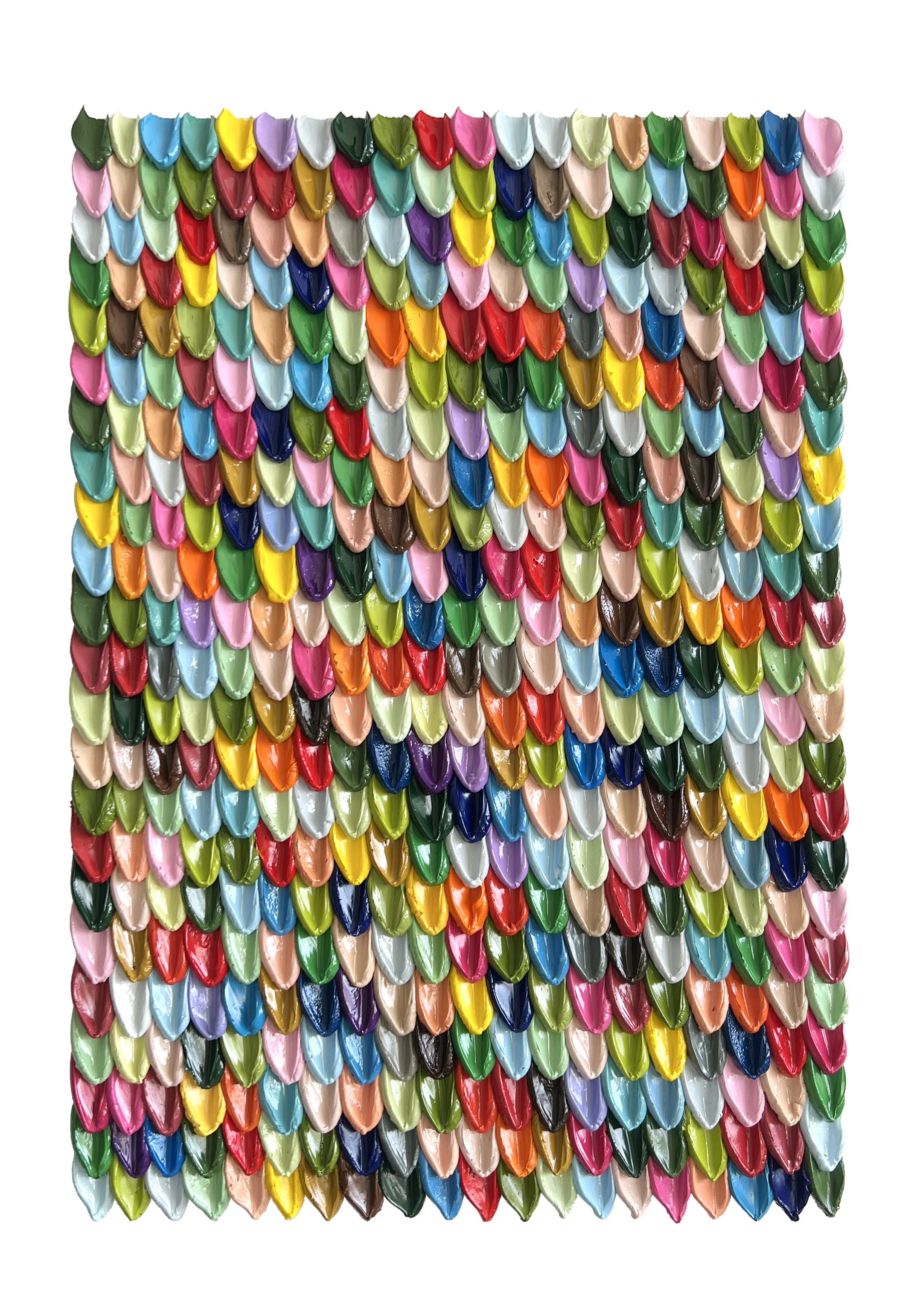
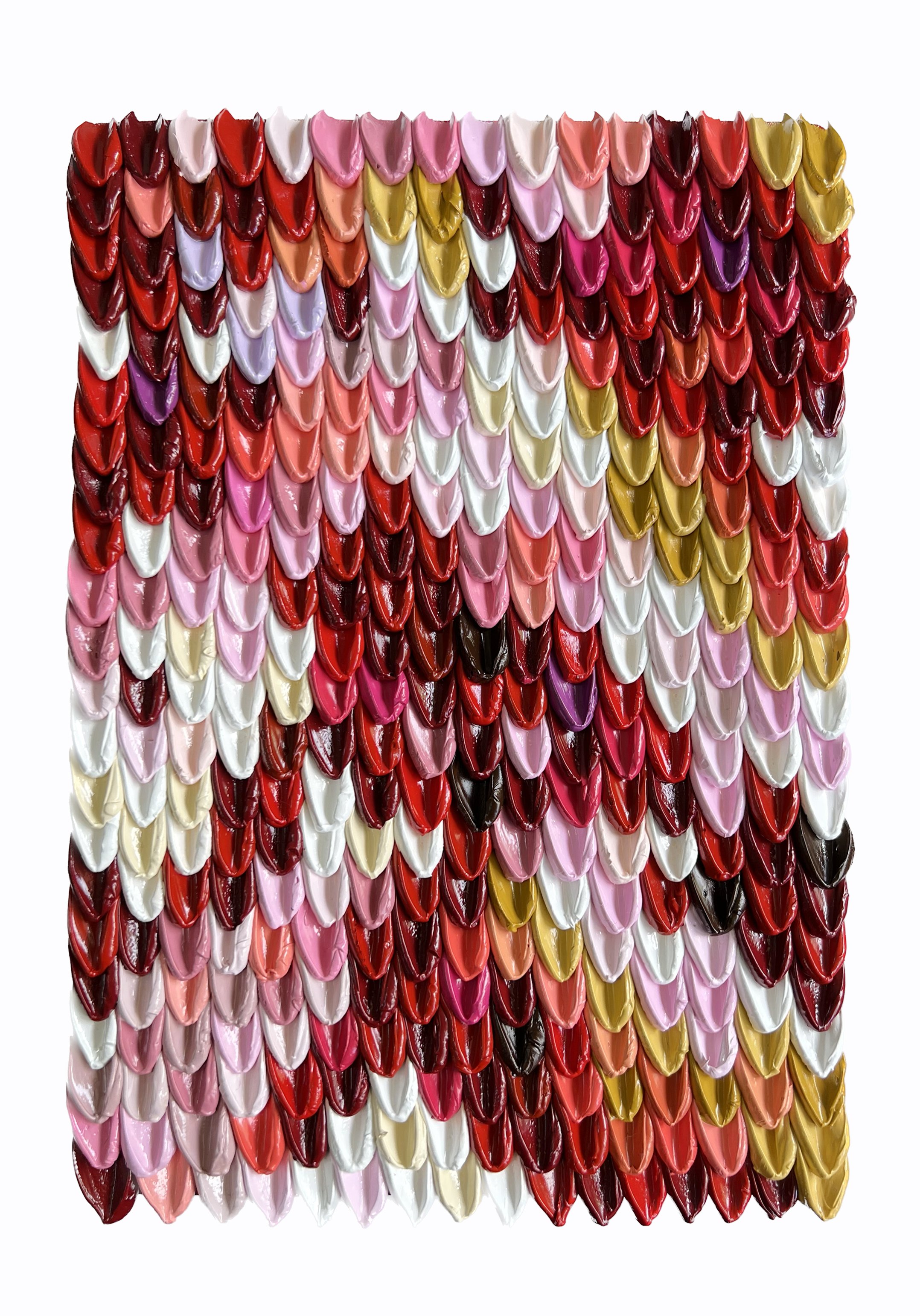
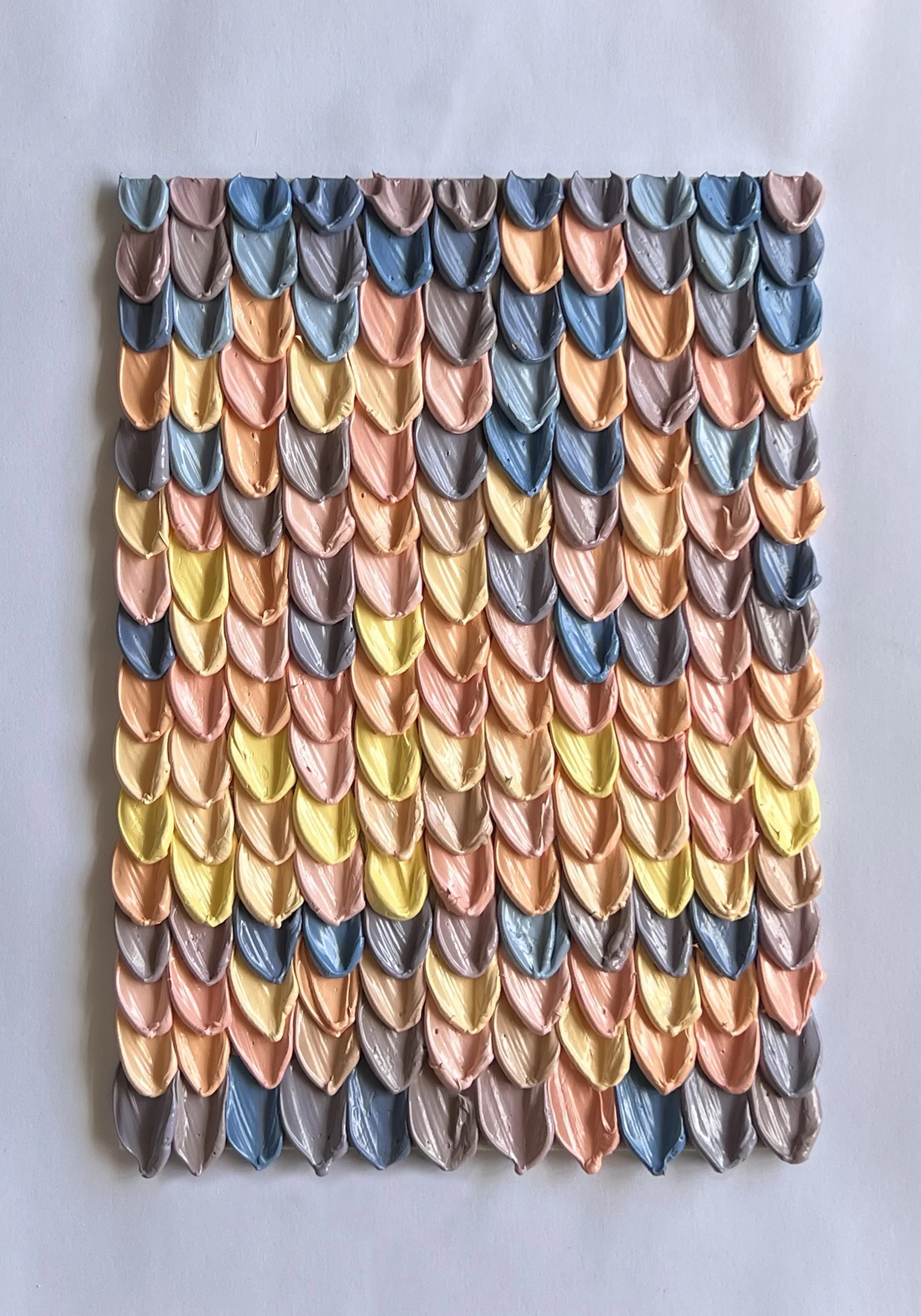
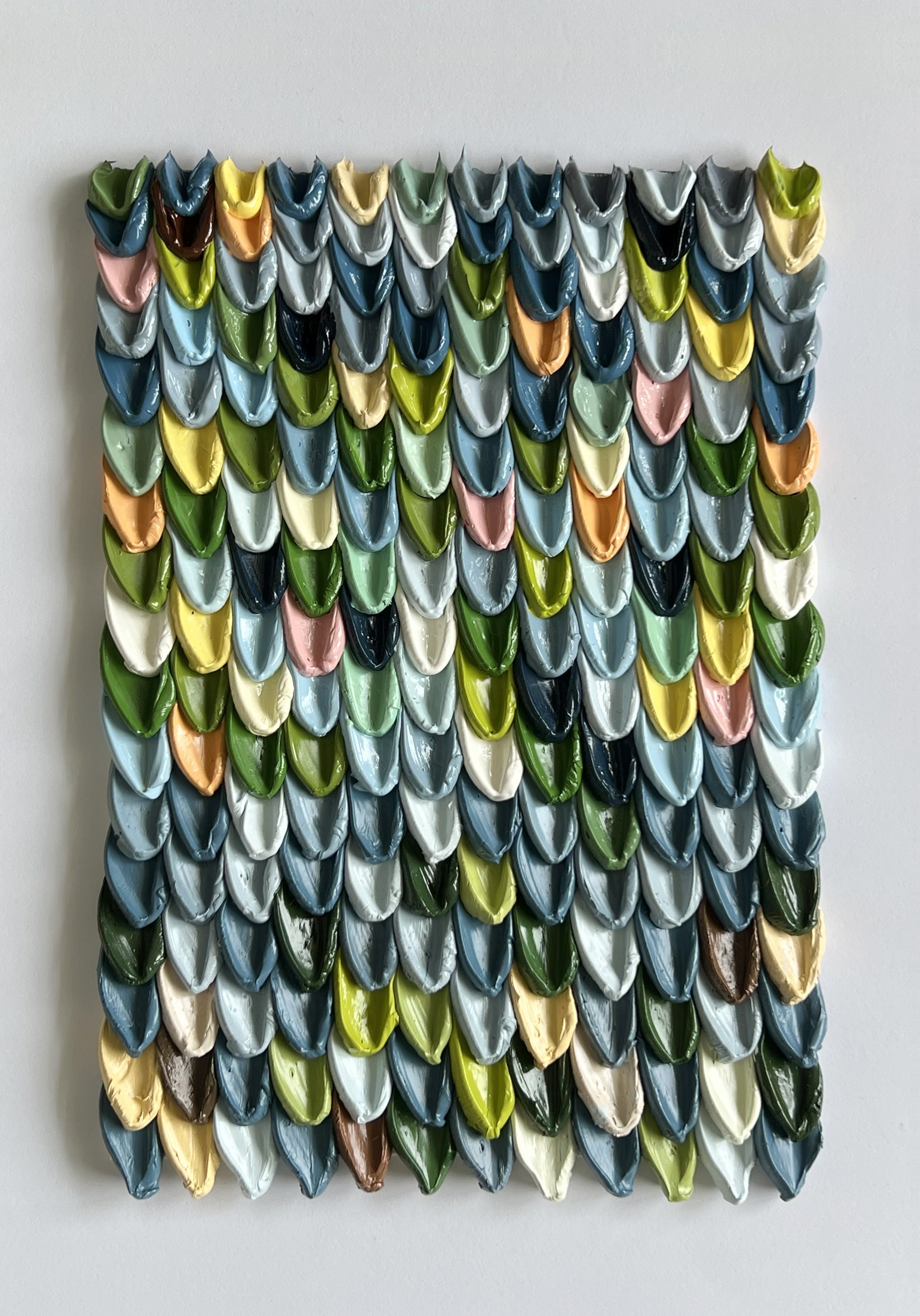
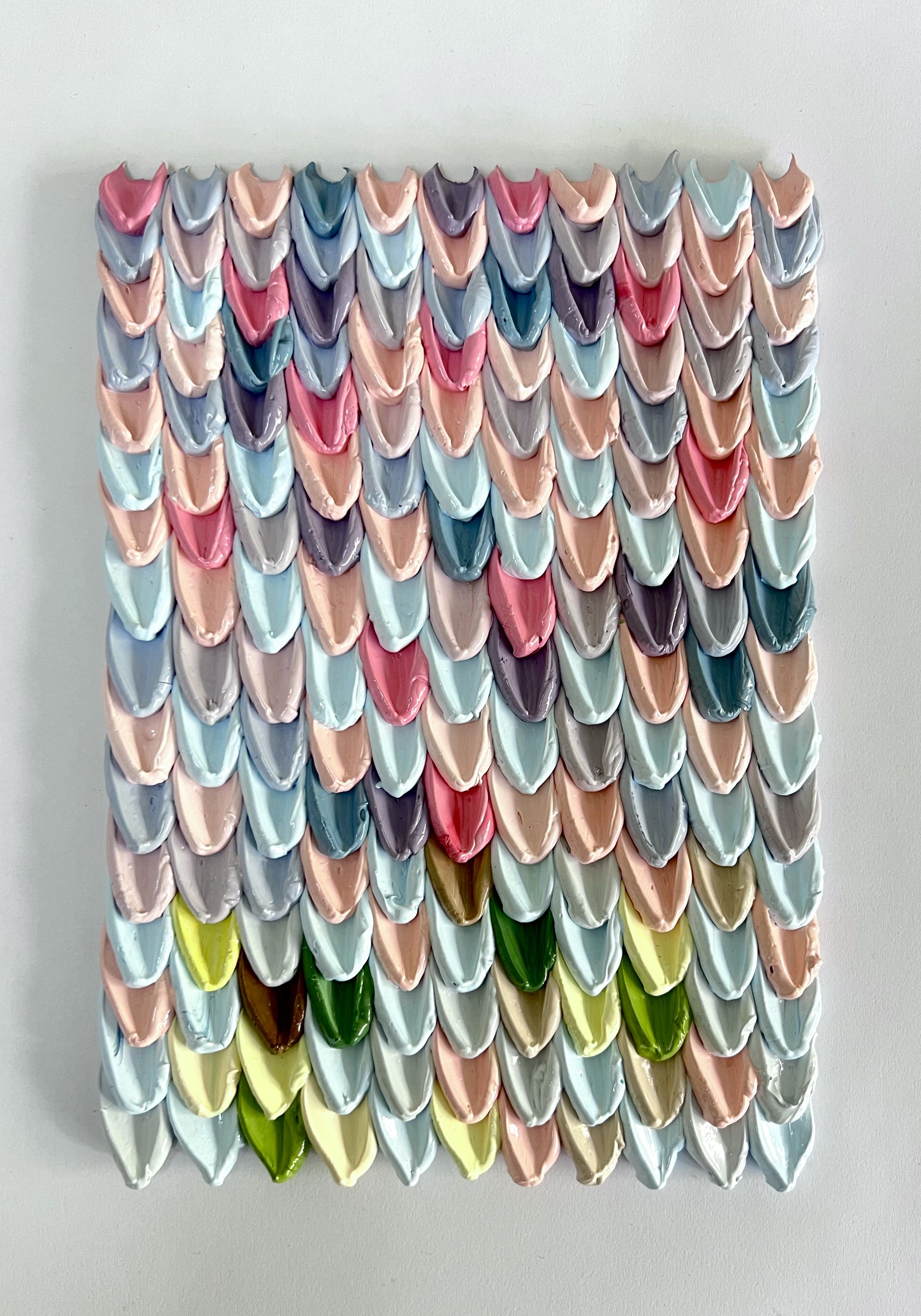
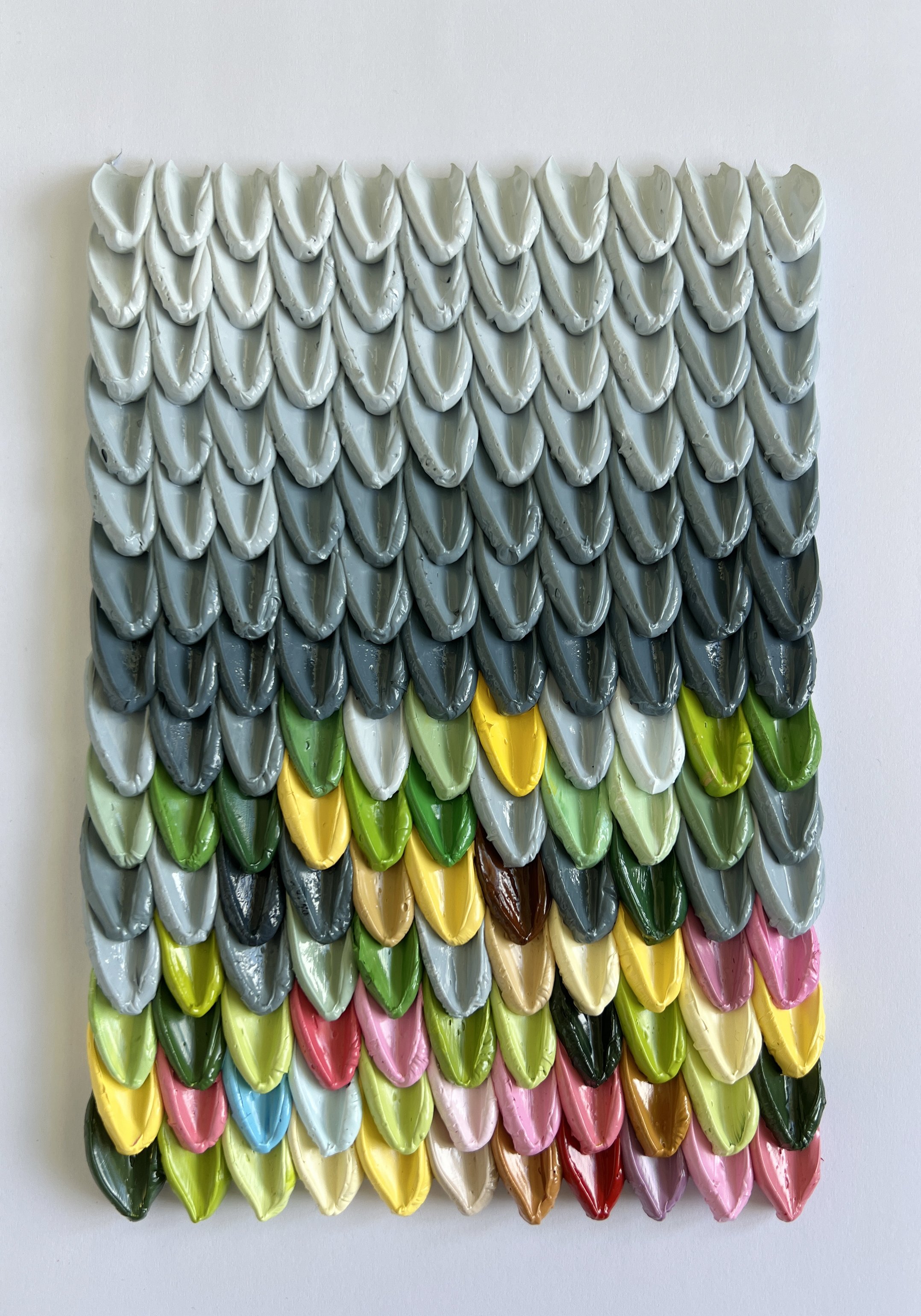
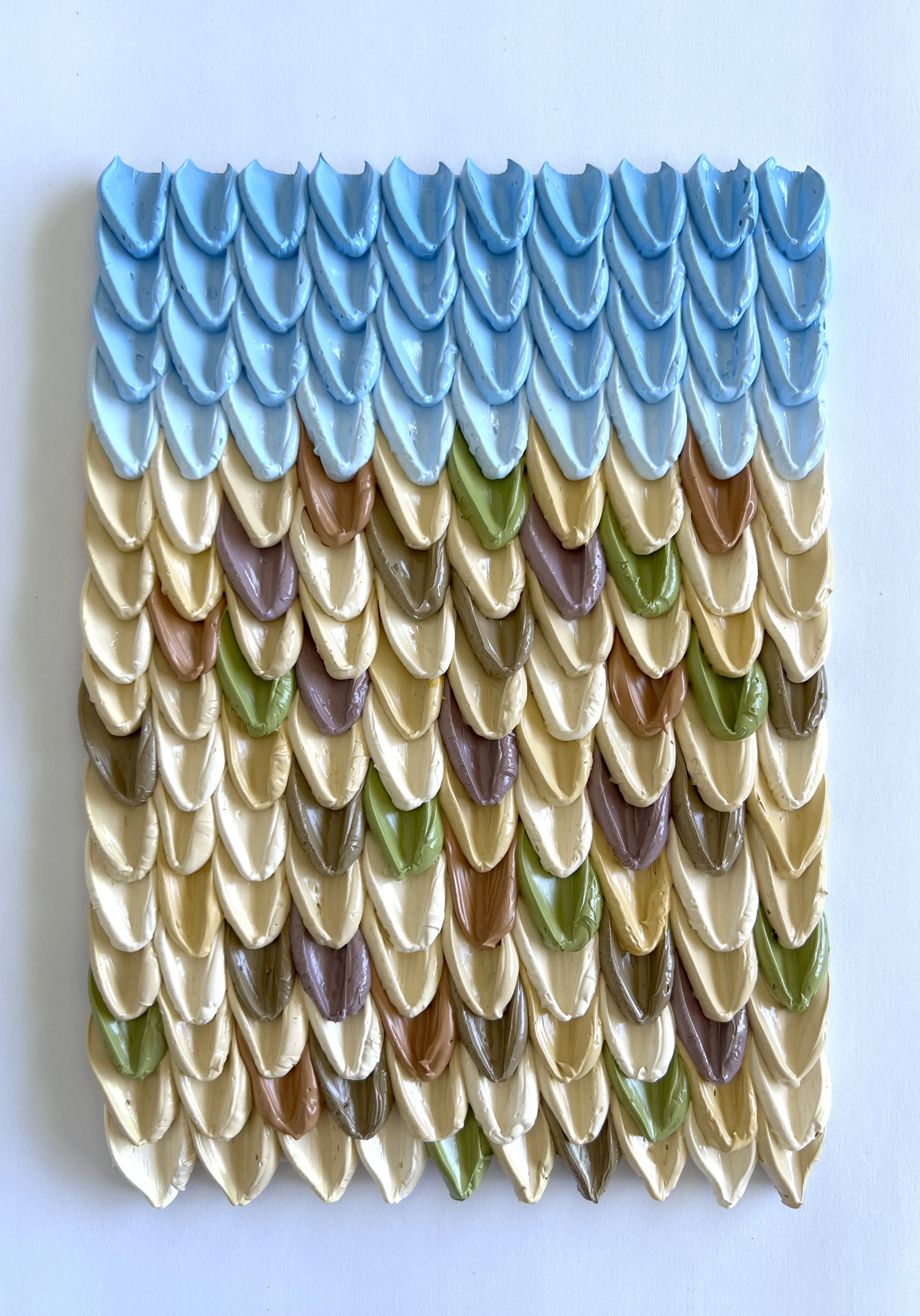
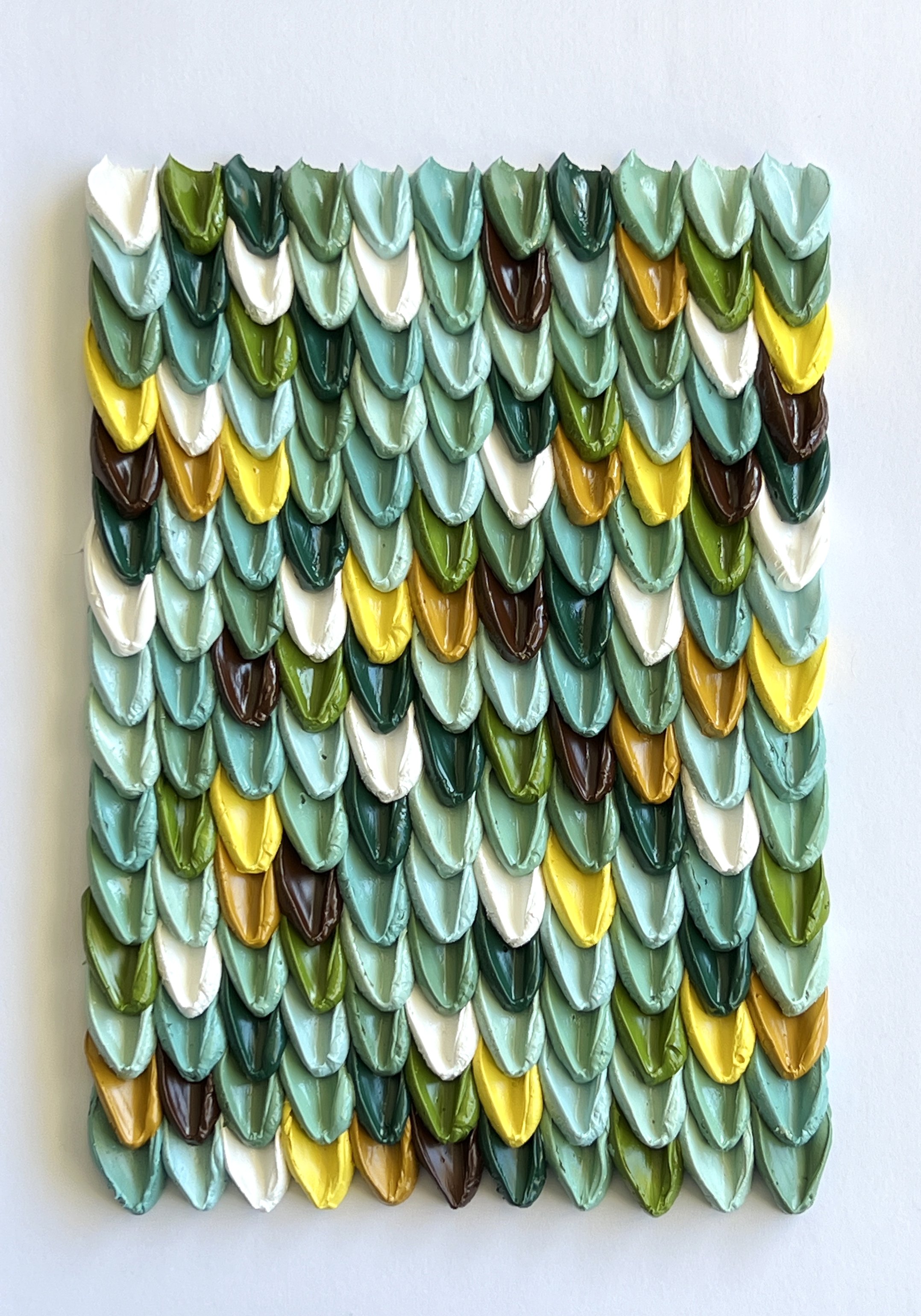
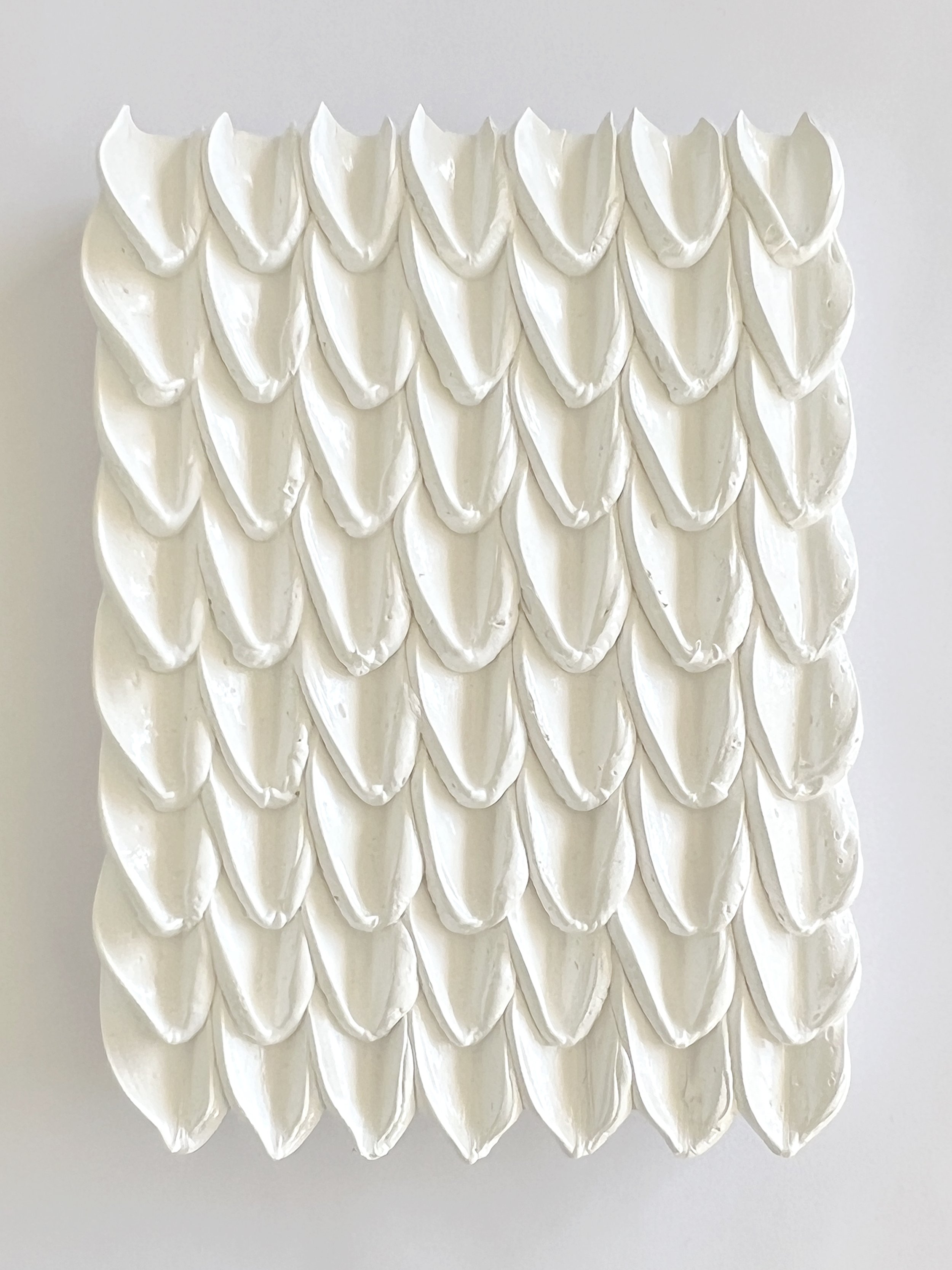
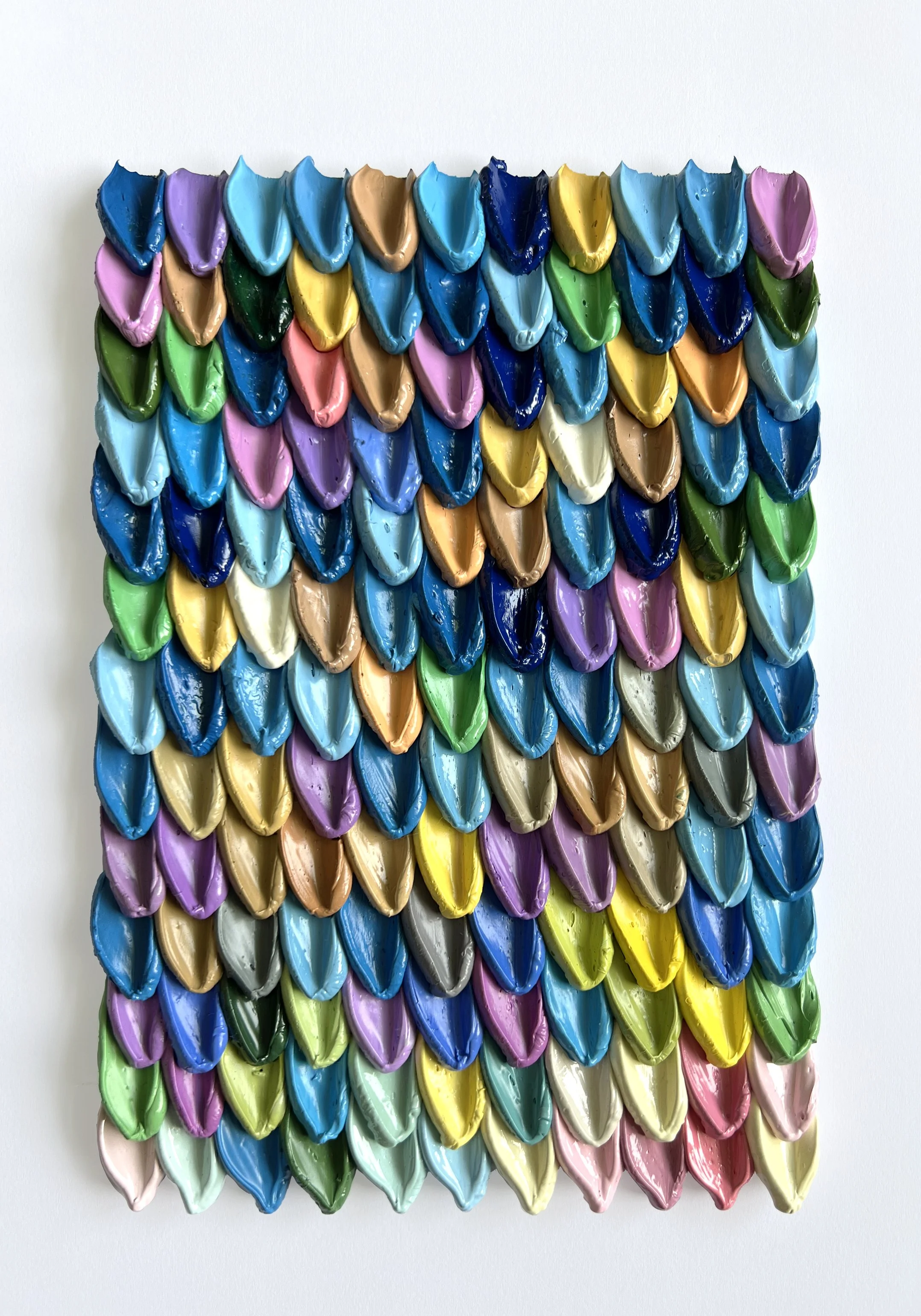
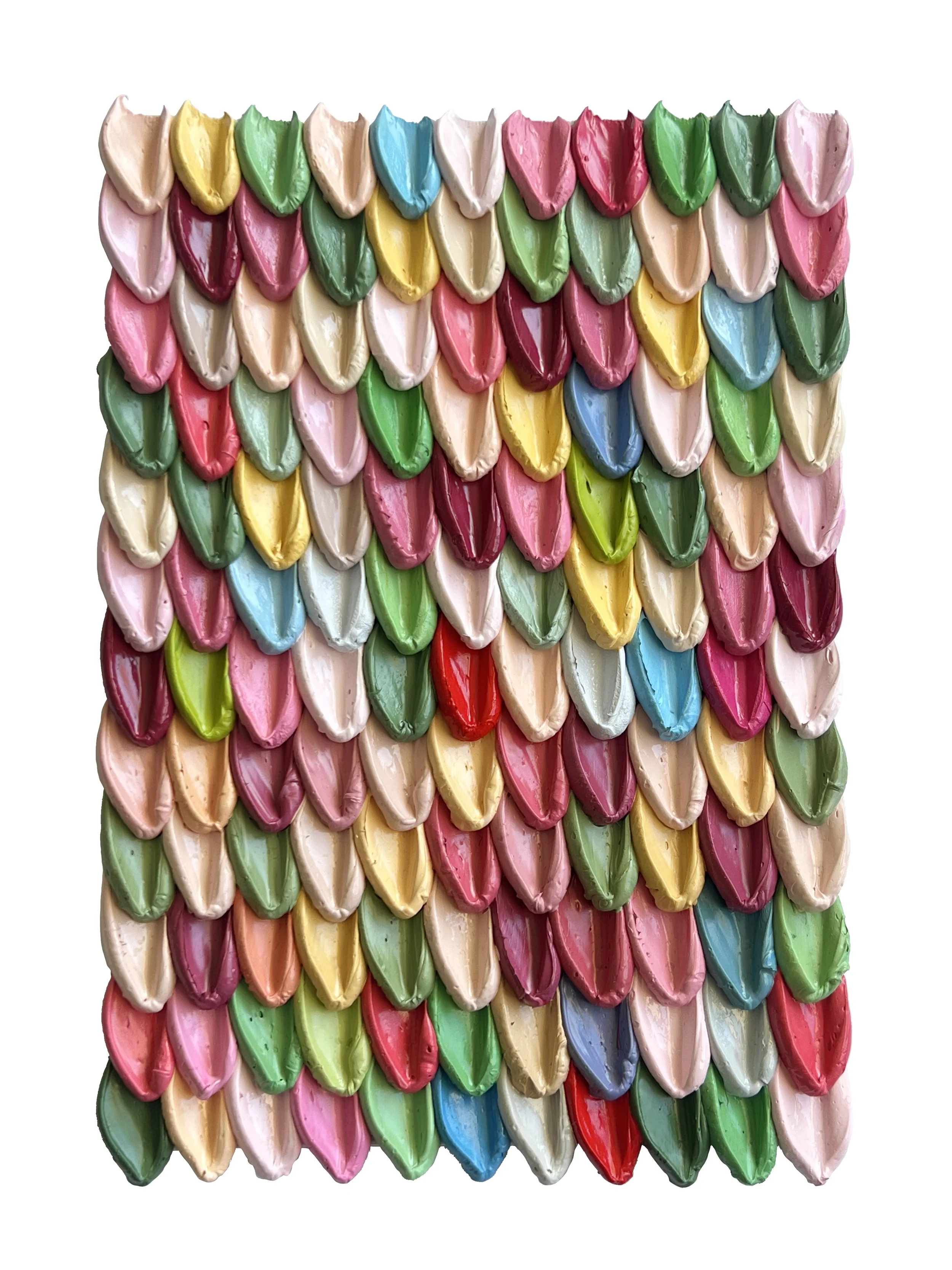
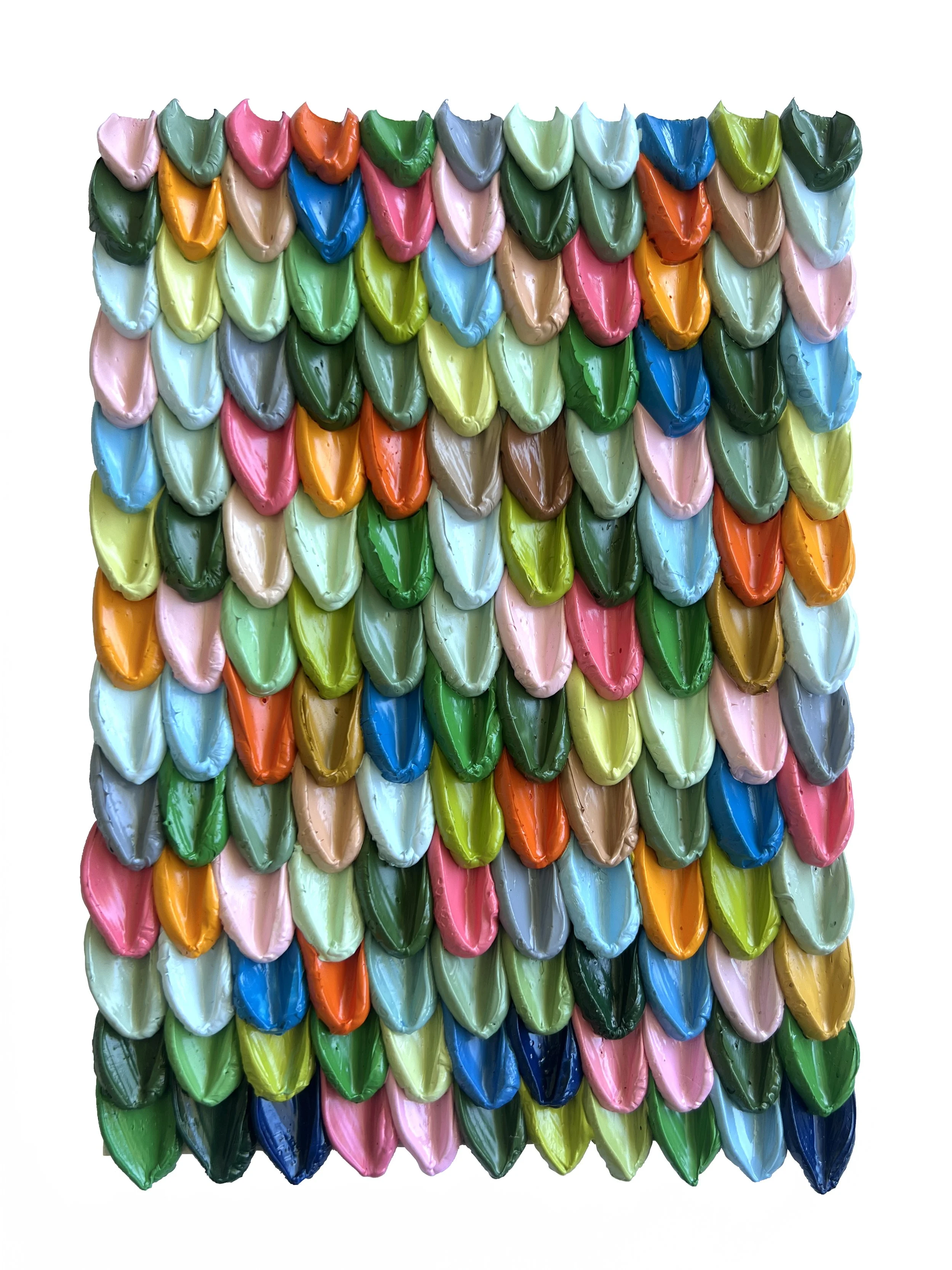
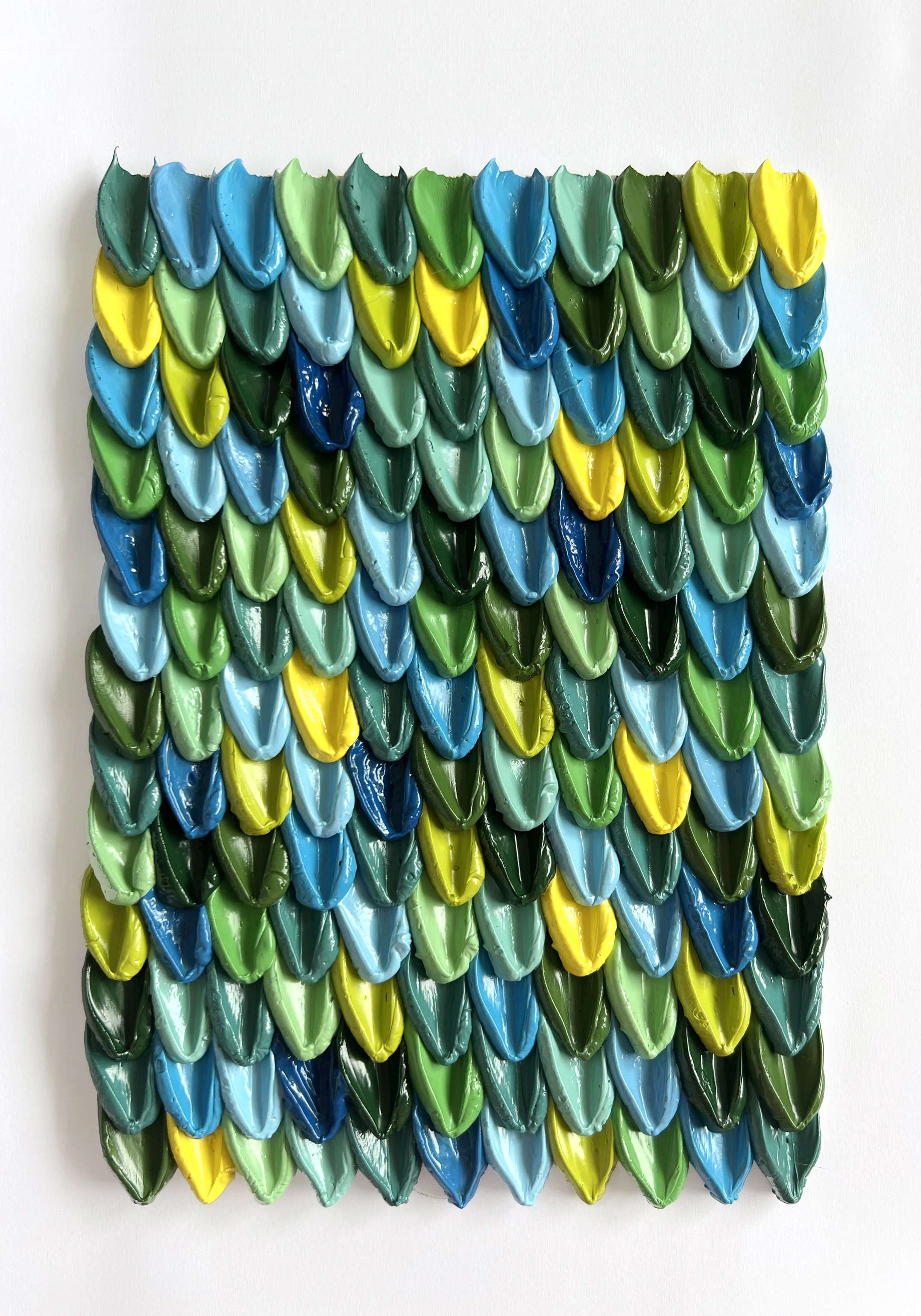
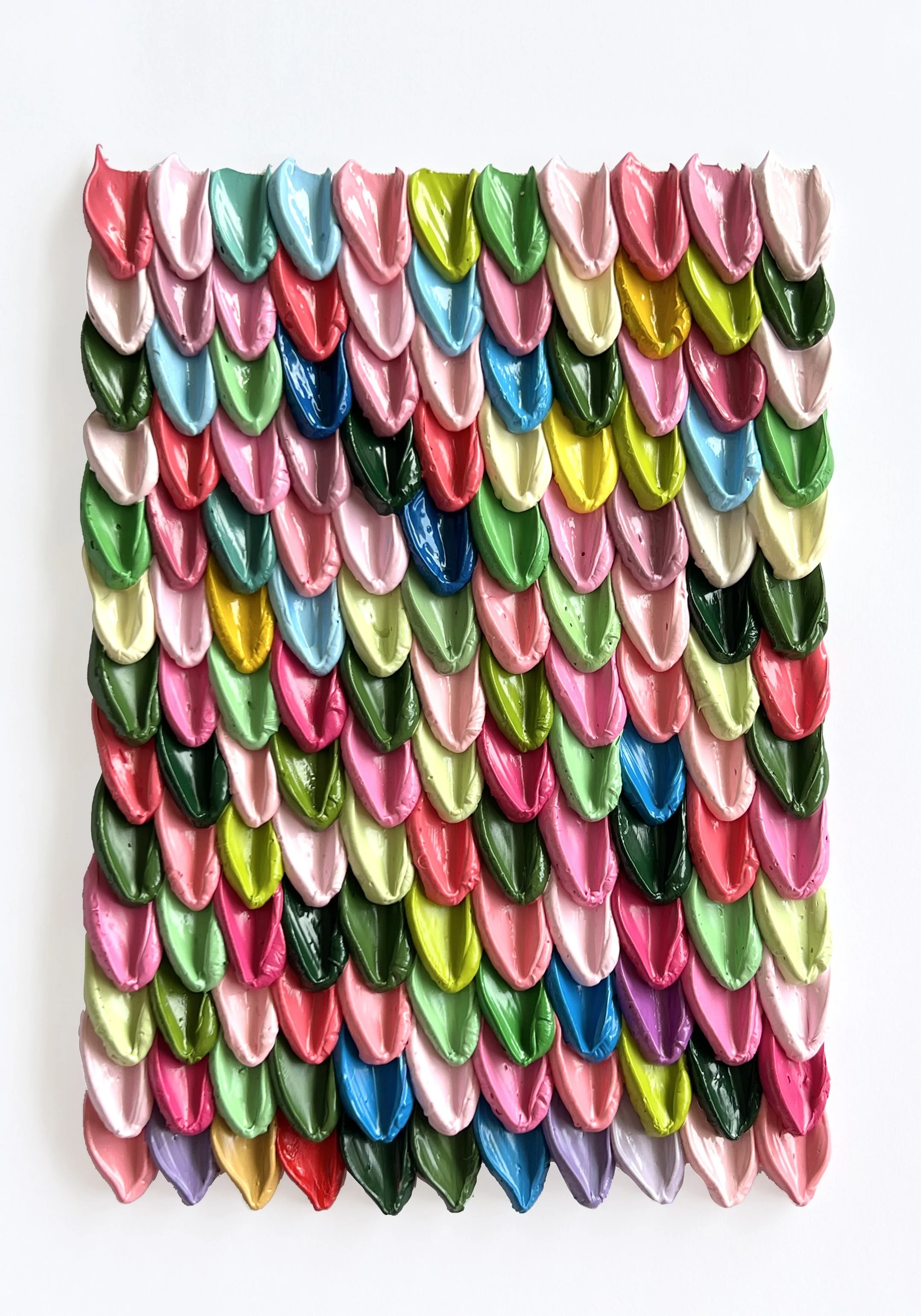
My little ‘Palette Cleansers’ (or ‘a Palette Scallop’ as I also like to call them) started as an experiment in colour and how different colours interact with each other independently, and also a way to use up my leftover paint from my palette. No influence, no colour coordinating, just put down the leftover paint and see what happens.
.
I love the way this ‘tapestry’ weaves together colours from various paintings (you’ll spot the cherry blossom colours, the hibiscus, the bougainvillea etc in the first one) but it also references the failures, the colours that were time consumingly mixed with love and then just discarded, or left out overnight because there wasn’t enough of it to save. It also reminds me of worn-out knitted jersey’s from the 80’s/90’s that your granny used to make from leftover wool ; )
I am selling these as I go in the effort to give the paint another chance at being a part of a painting, and to raise some funds so I can buy more….paint!
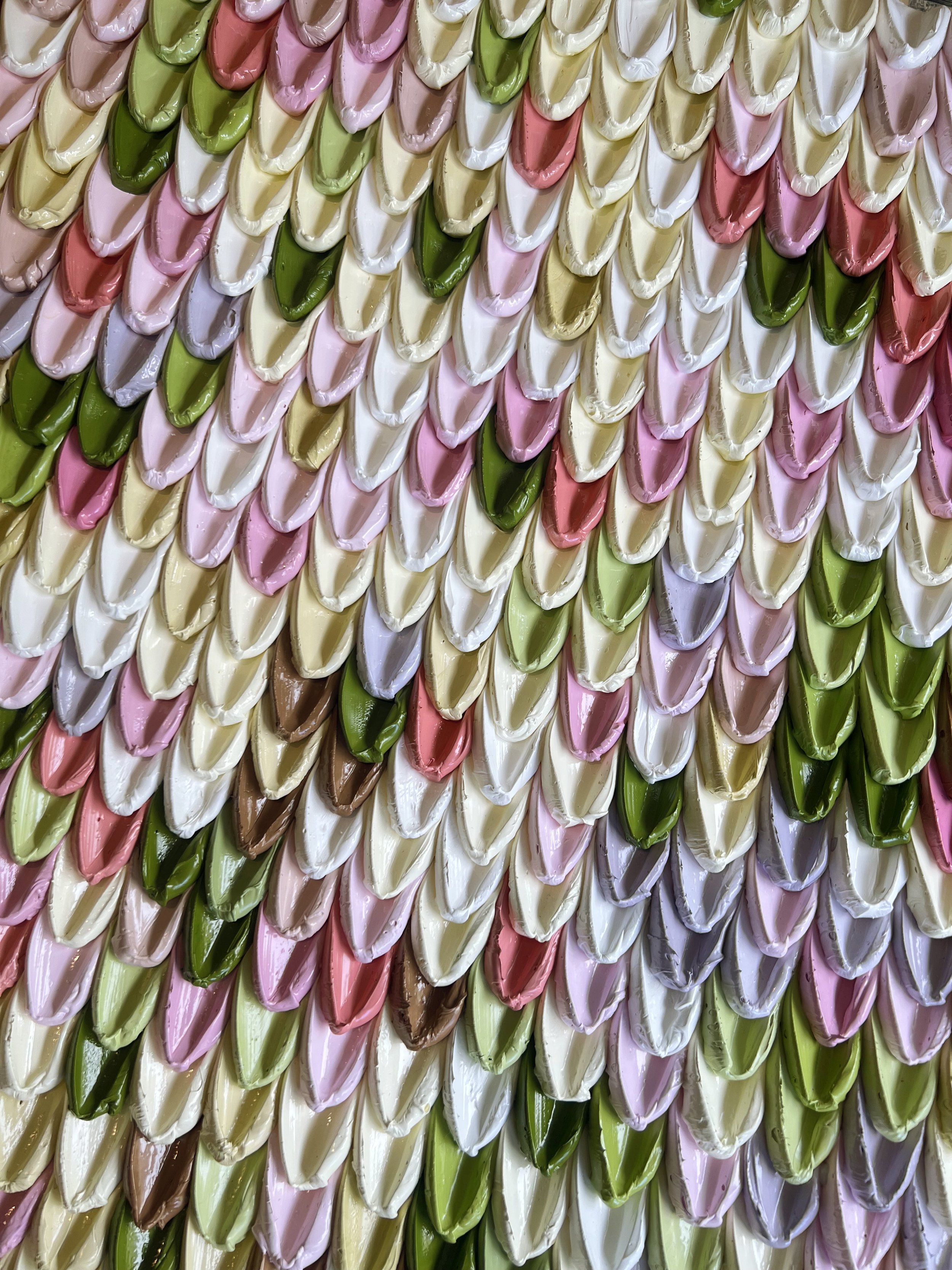
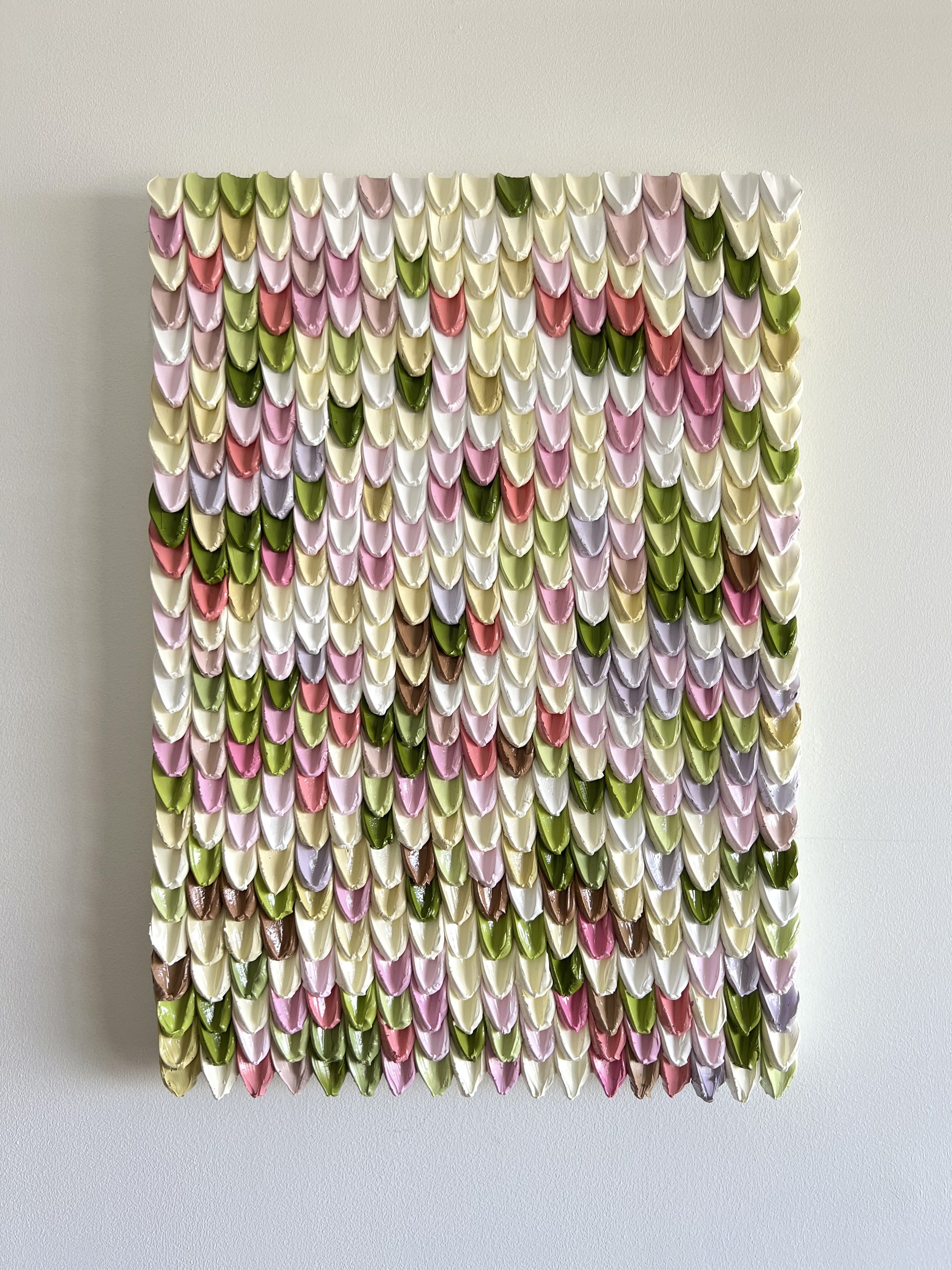
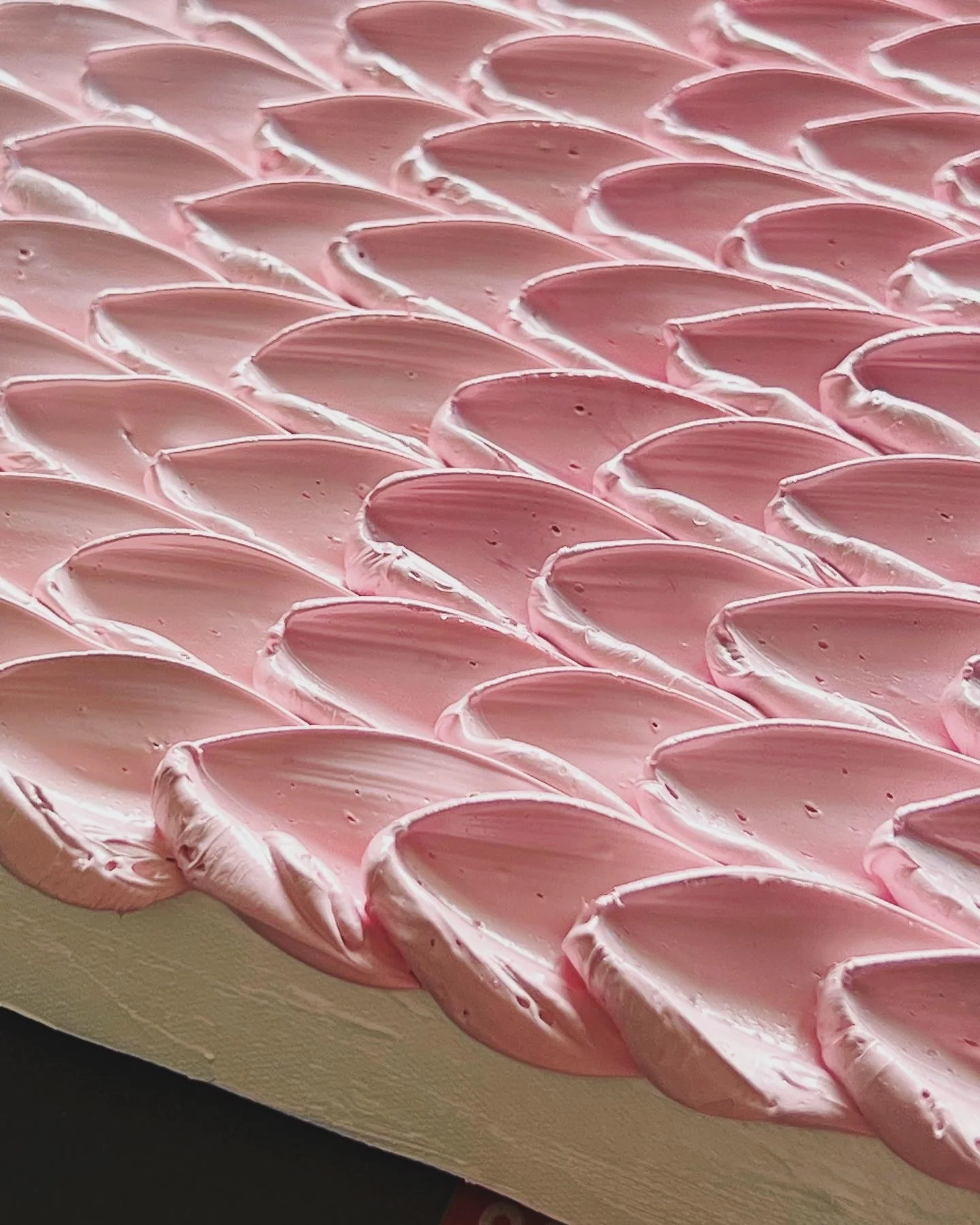
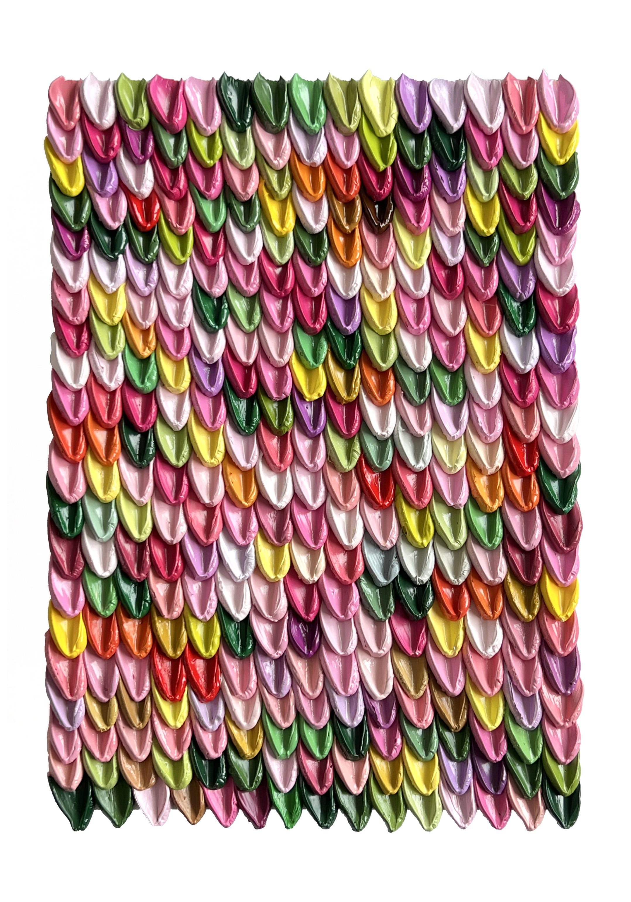
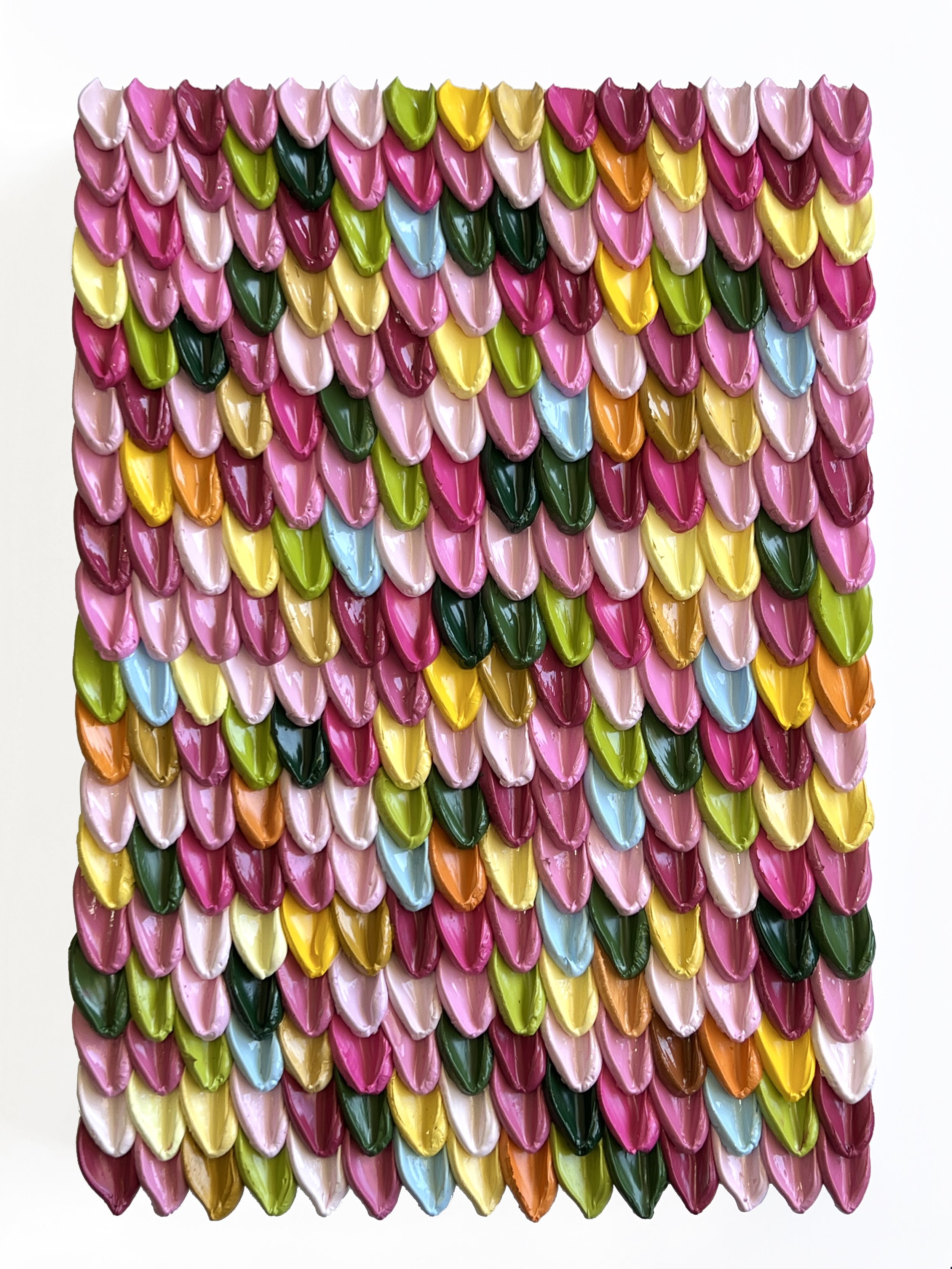
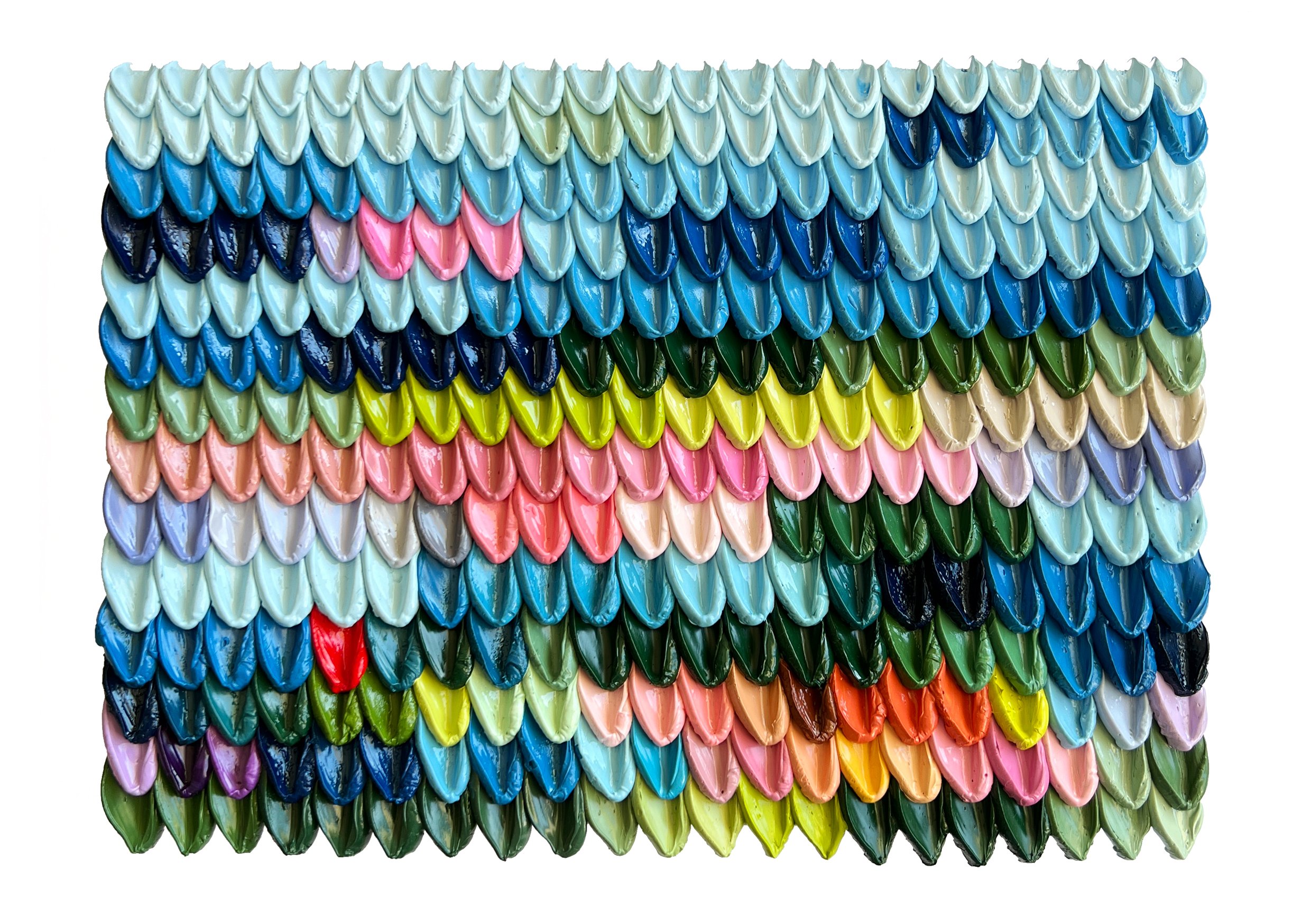
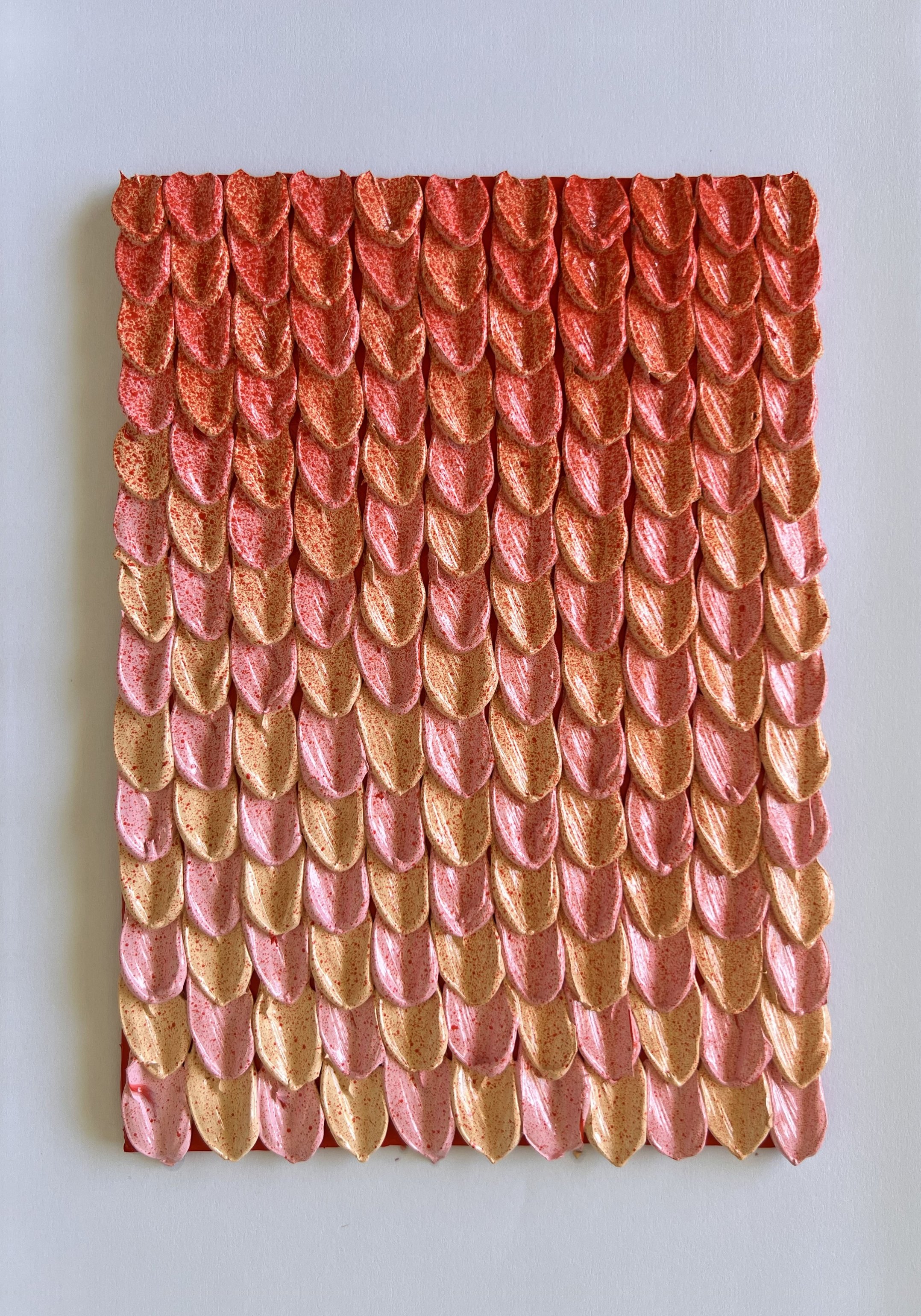
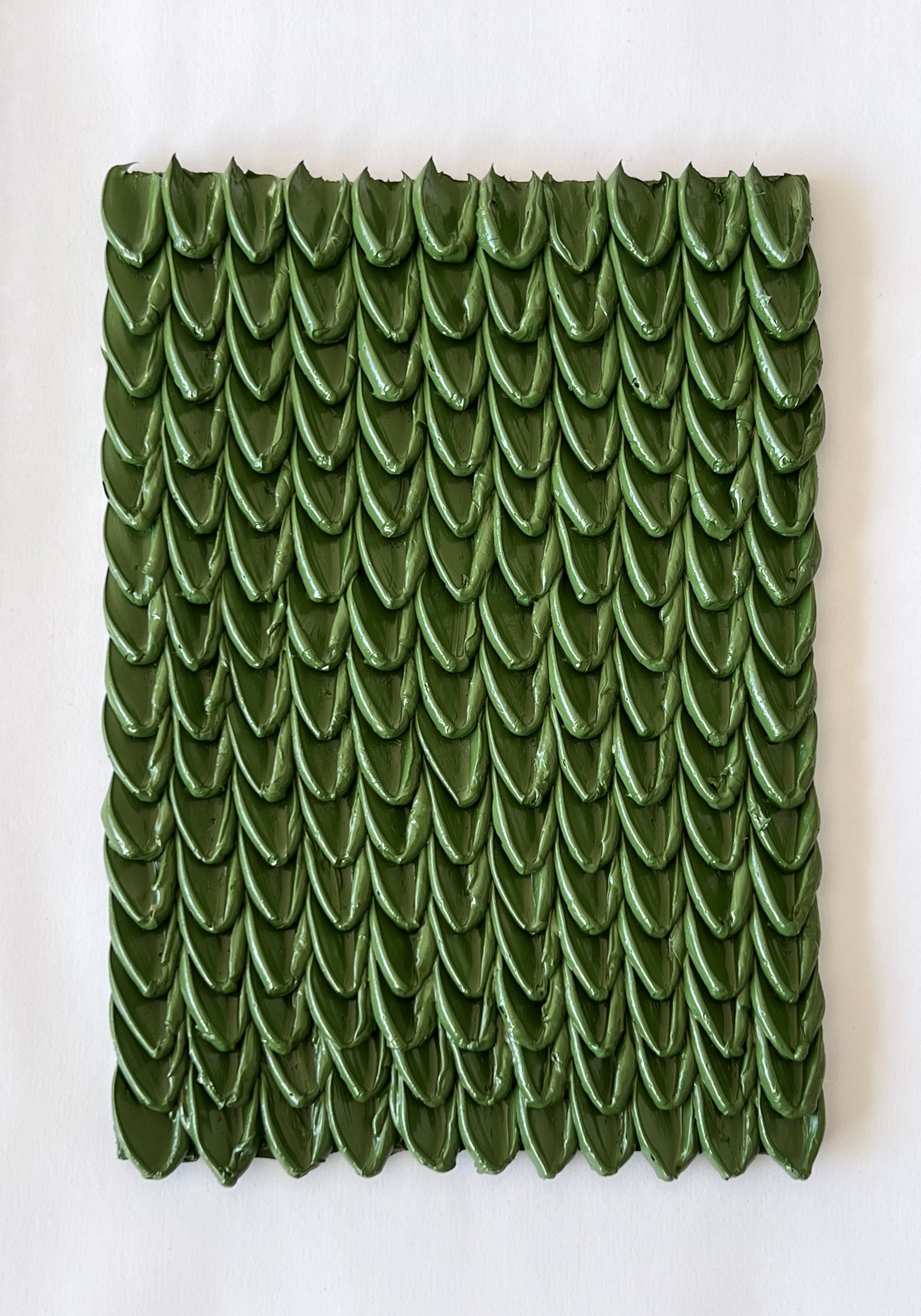
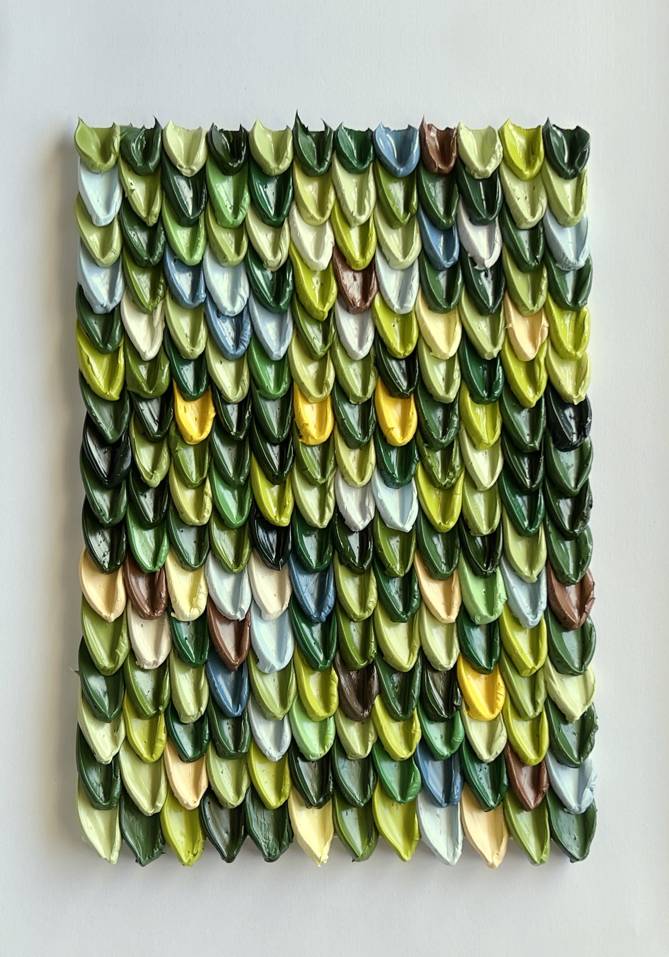
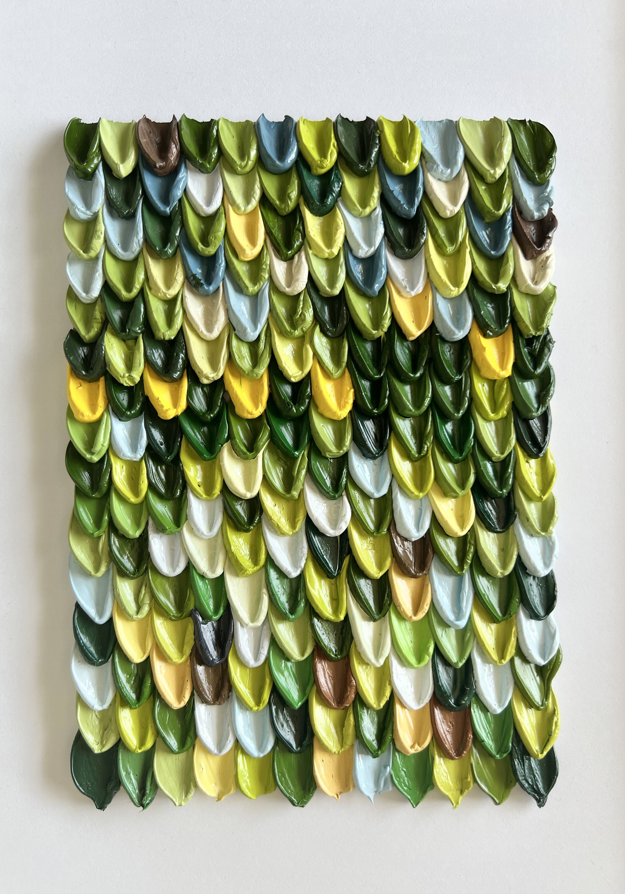
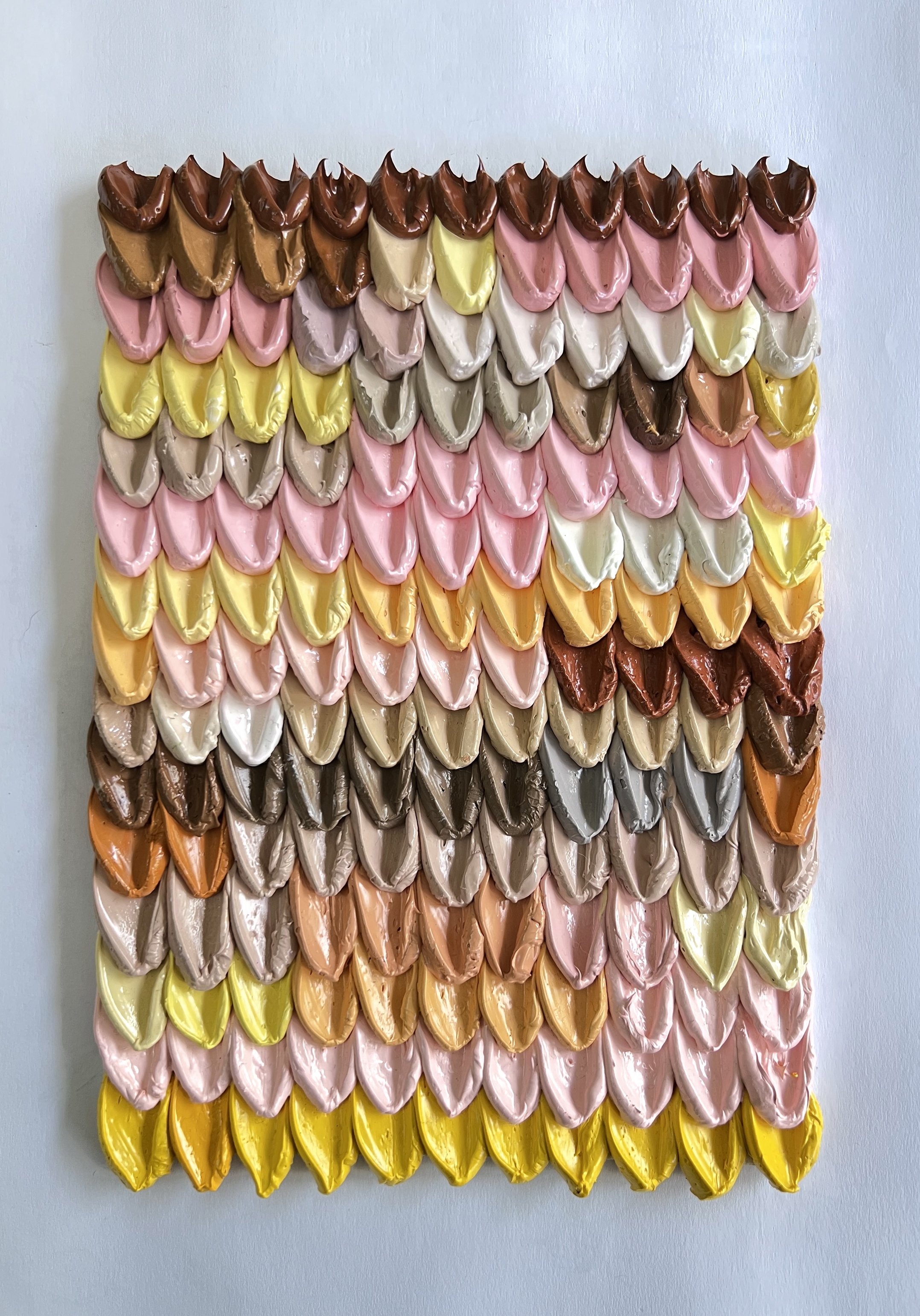
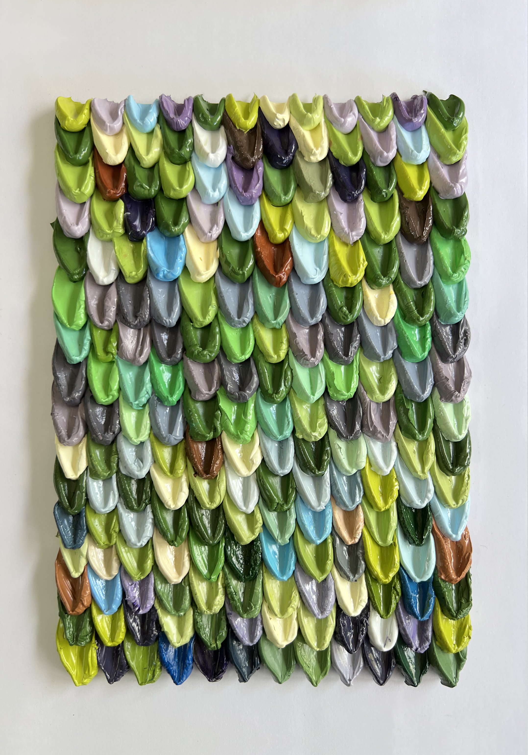
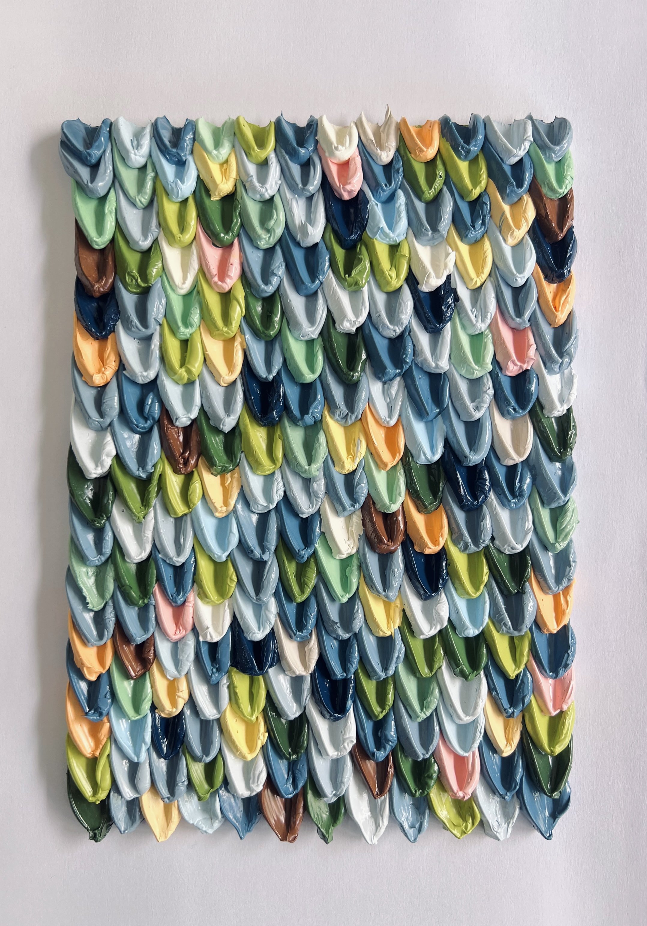
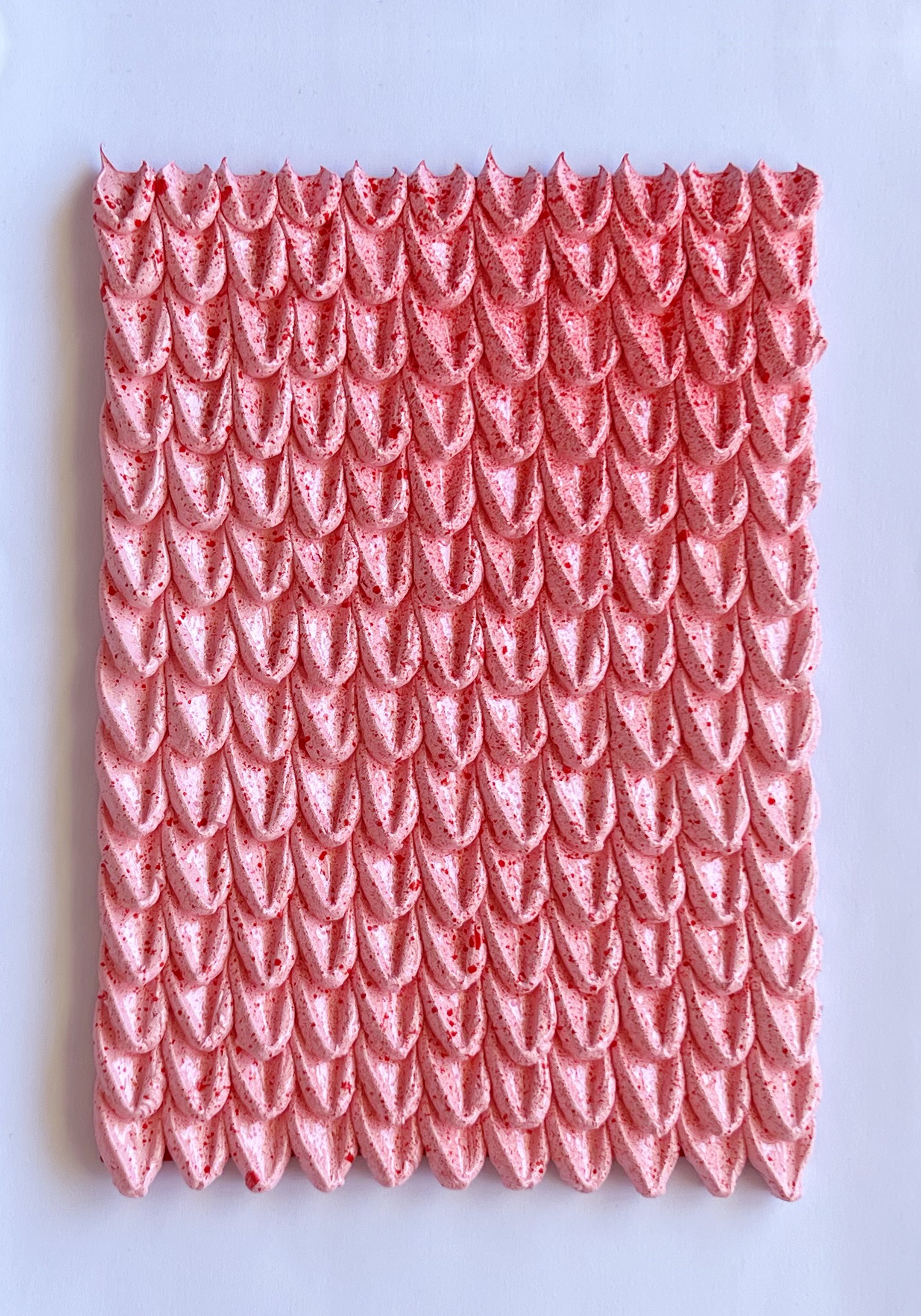
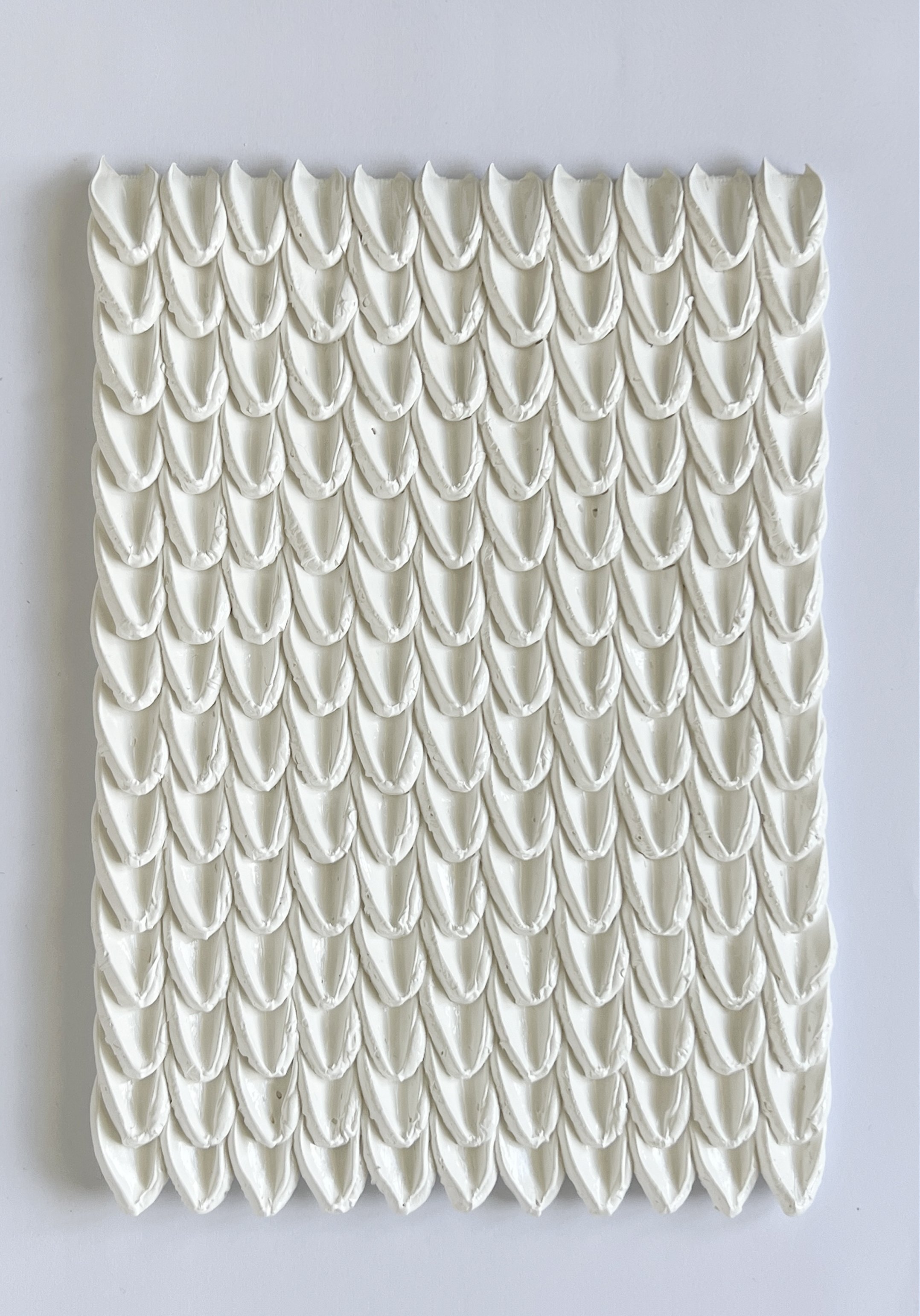
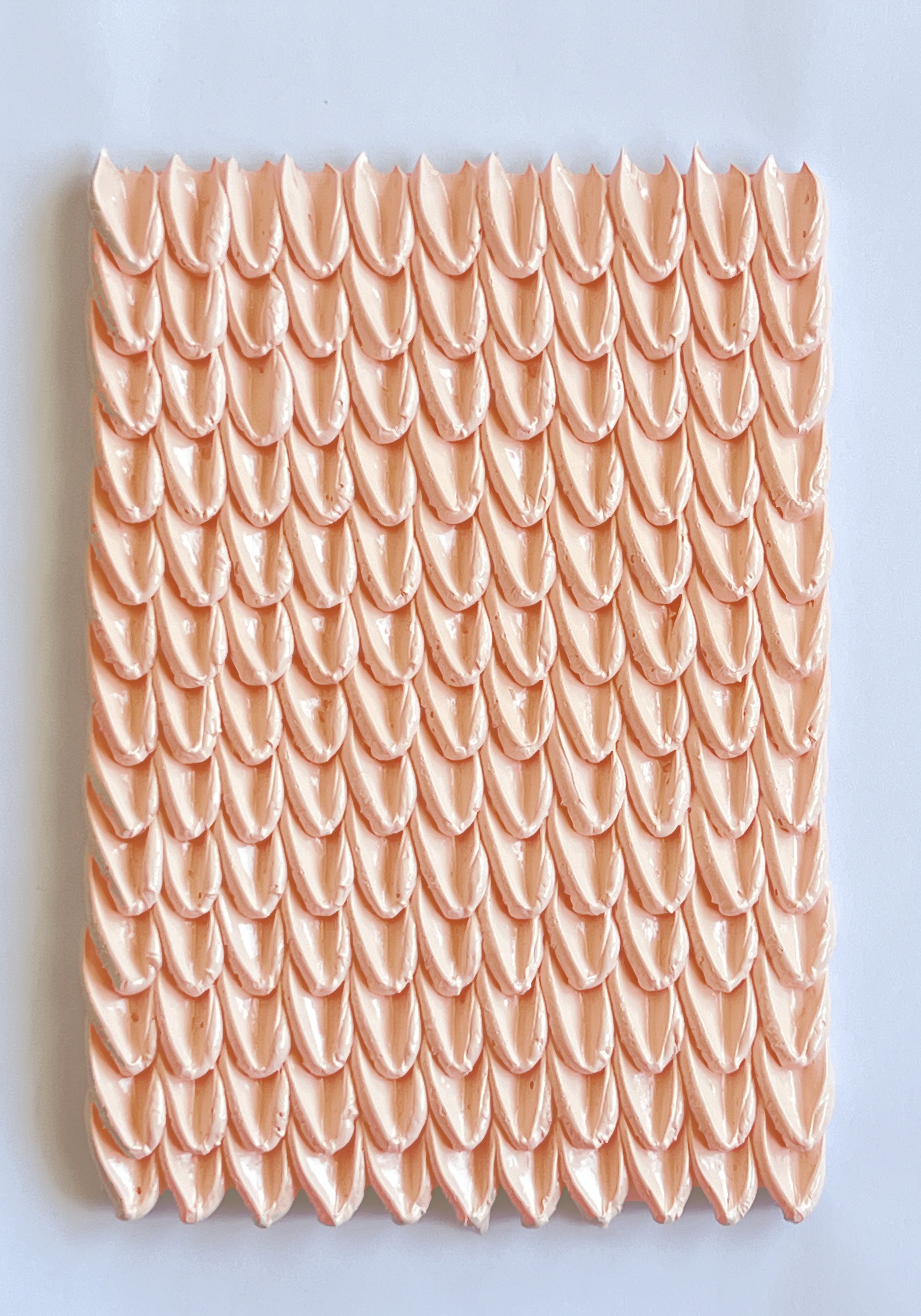
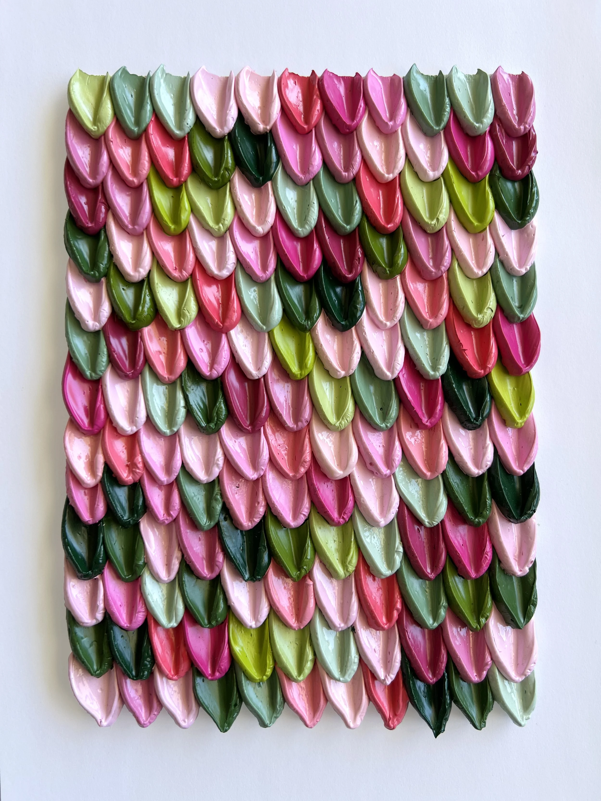
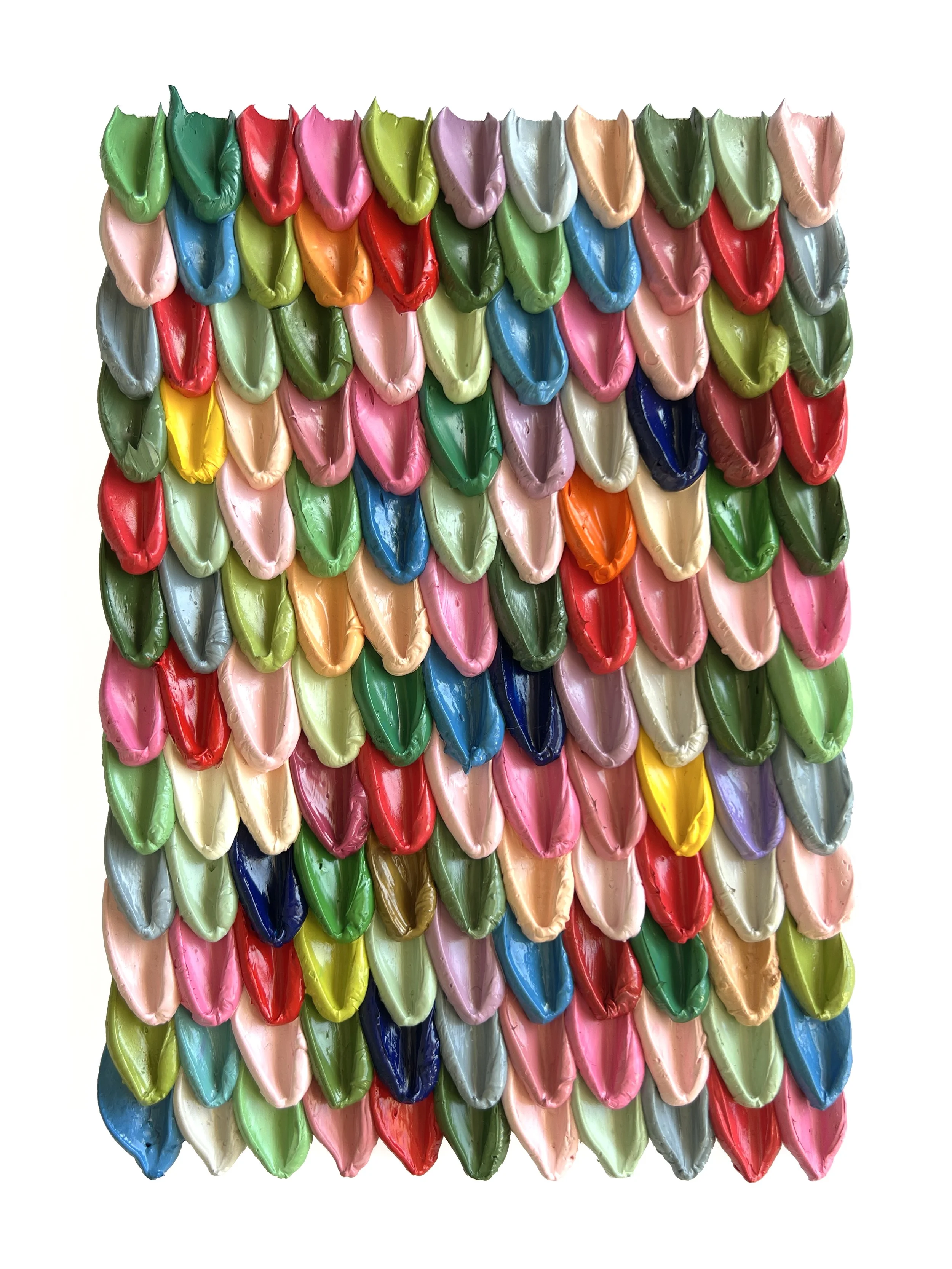
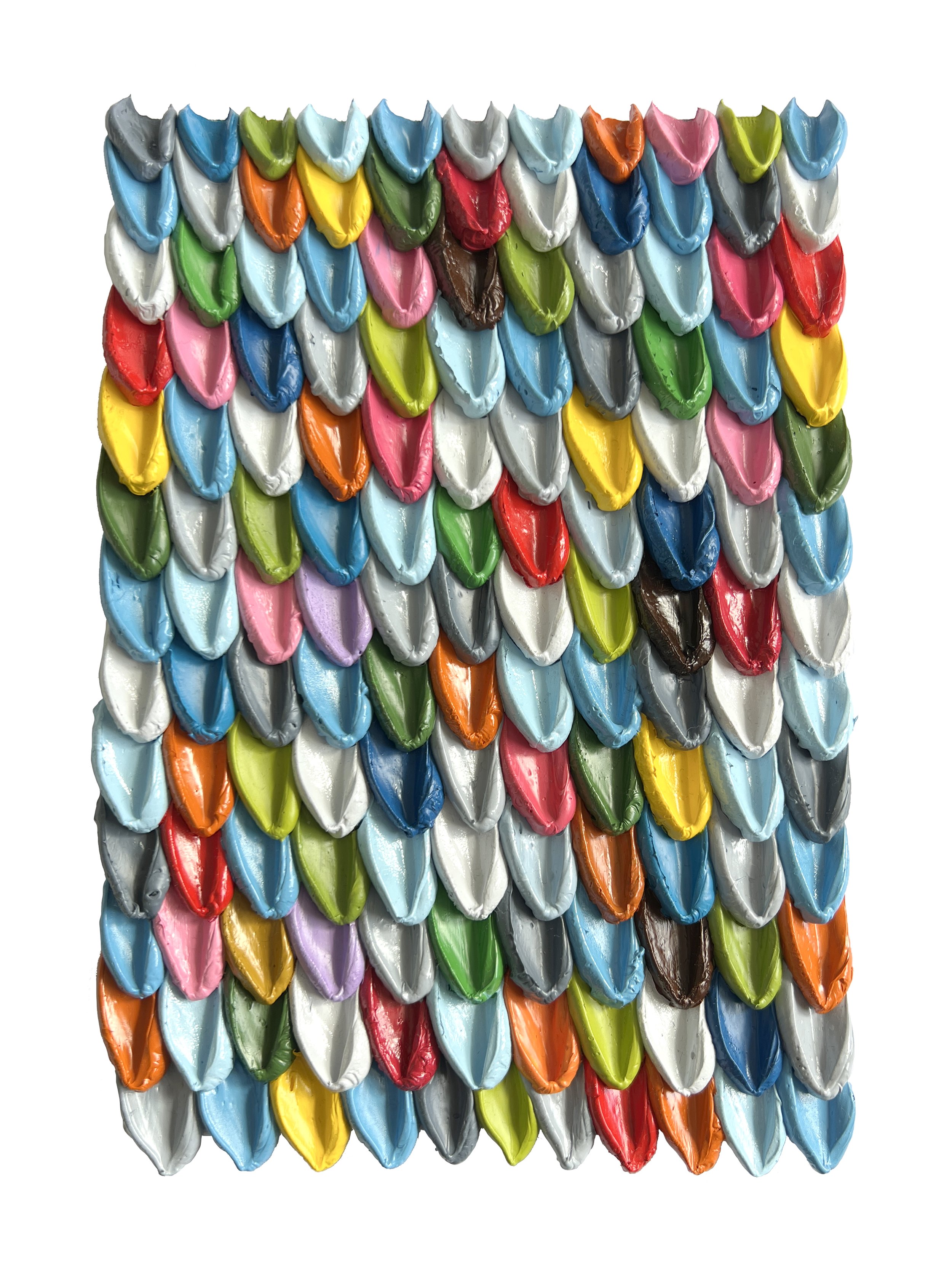
The palette scallops keep evolving and I have been experimenting with both colour and form within this very rigid structure.
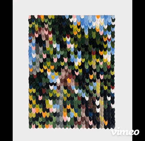
The first painting below is 80cm h x 60cm w. It was inspired by the beautiful palm trees at the Pamplemousses botanical gardens in Mauritius and was made for an exhibition in Mauritius. I included a rough video so you can see how much the painting changes in different light.
These paintings below are 80 x 60cm


These paintings below are 60 x 40cm

These paintings below are 42 x 30cm (A3)


These paintings below are 30 x 21cm (A4)


These paintings below are 21 x 14cm (A5)


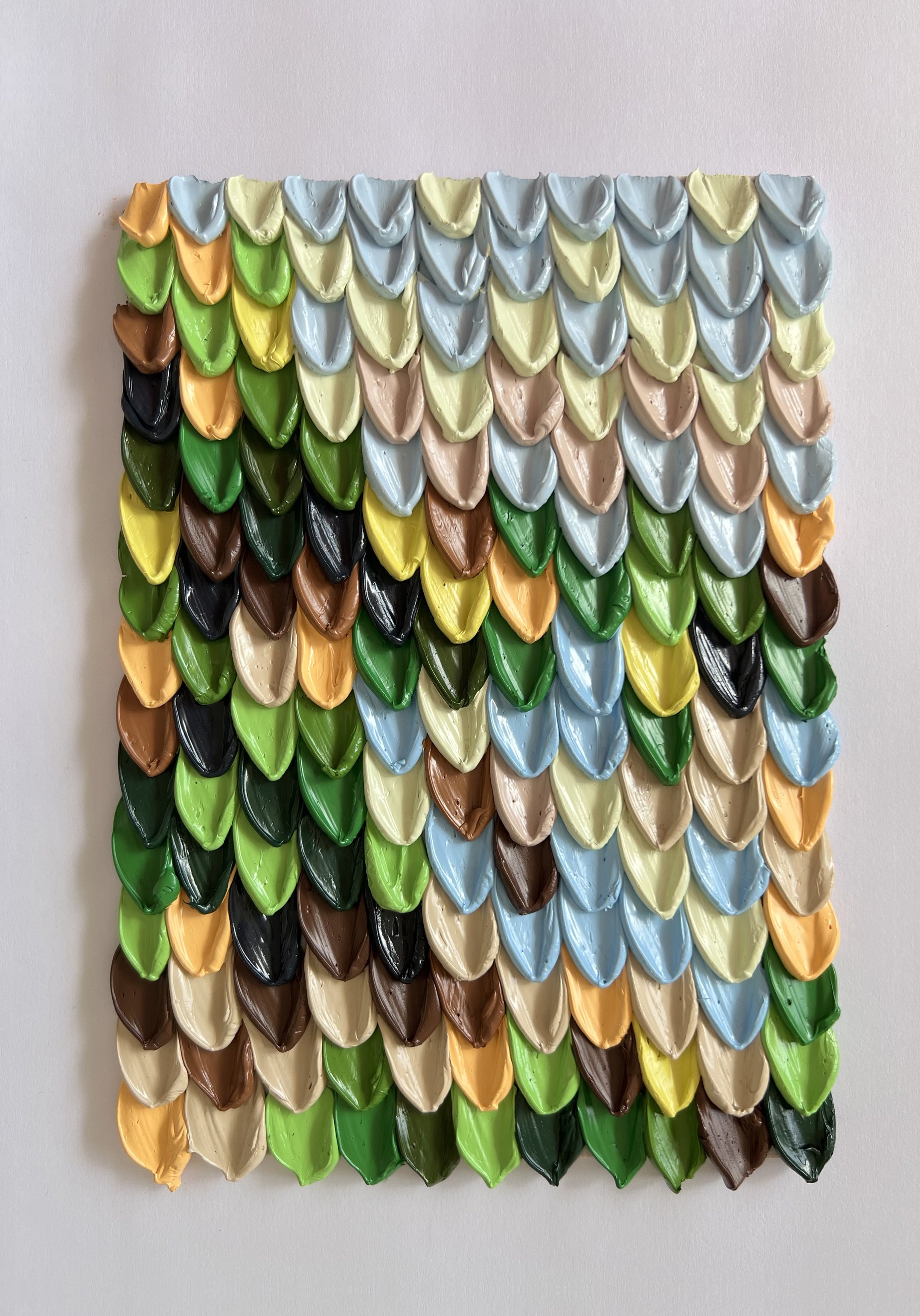


Palette Scallop Chromatics is a collection of Palette Scallop paintings that I created to exhibit and showcase the different styles of these weird and wonderful paintings. For example there are the palette cleansers, where leftover paint dictates the colour palette, or there are the more literal ones like the Pin Cushions triptych. Given the number of paintings involved in the show, it was such a great opportunity to explore and experiment, predominantly with colour. Colour is the theme of the collection, hence the name, and a lot of the paintings have been named after colours that tell a story. A book I often refer to called “The Secret Lives of Colour” by Kassia St Claire was a helpful resource for this.
I wanted visitors at the show to see the full range up together so they could mix and match their own diptych’s or triptych’s within the collection. I was so surprised by how many different combinations worked, more than I had planned, and I thought it would be fun for collectors to “customise” their sets for their homes.
